Preview image. Unlock full-res
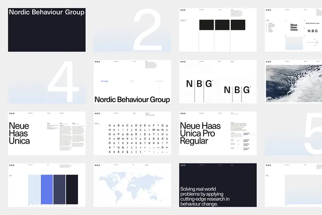
Overview grid of sixteen brand guideline slides in a restrained Swiss style, pairing a deep navy and pale blue palette with Neue Haas Unica specimens, logo construction grids, and oversized section numerals.
Summary
A four-by-four overview grid of brand guideline slides for "Nordic Behaviour Group", executed in a disciplined Swiss idiom: white and pale-blue gradient fields, a deep navy accent, and Neue Haas Unica doing all the typographic work.
Visual description
Sixteen 16:9 slides on a light grey background. The opening slide sets the wordmark white on deep navy; subsequent slides show giant single numerals (2, 4, 5) ghosted over soft blue gradient bands, logo construction diagrams with circular grid overlays around an "N B G" monogram, full alphabet and glyph specimens, a "Neue Haas Unica Pro Regular" typeface page, a five-swatch blue color palette bar chart, a pale dotted world map, and an aerial cloud photograph. A closing navy slide carries the mission line "Solving real world problems by applying cutting-edge research in behaviour change." Every slide keeps a consistent tiny header row of navigation labels.
Key takeaway
One typeface, two blues, and enormous scale shifts (tiny header metadata vs. full-bleed numerals) are enough to make a guideline system feel rigorous and premium. The ghosted oversized numerals double as section dividers without any decoration.
Reuse notes
A strong template for research, consulting, or B2B brand guideline decks that need to signal precision. The soft gradient bands keep the minimalism from feeling sterile. Works best when the brand genuinely commits to a single sans-serif family; the system has no room for a second voice.