Preview image. Unlock full-res
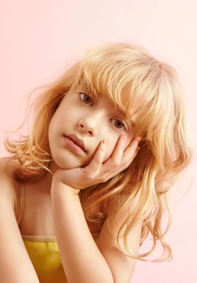
A close-up portrait of a young girl with blonde hair resting her chin on her hand against a solid pink background.
Summary
A close-up portrait of a young girl with blonde hair resting her chin on her hand against a solid pink background.
Visual description
The subject is a young girl with wavy blonde hair and bangs, positioned centrally and looking towards the camera. She rests her chin on her hand, creating a contemplative pose. The background is a solid, soft pink color that complements her warm skin tones and hair.
Key takeaway
Use soft, pastel color palettes and gentle lighting to create a dreamy, emotive portrait.
Reuse notes
Ideal for beauty, fashion, or lifestyle editorial photography requiring a soft and youthful aesthetic.
More like this




Keep what you find
A free account saves references to boards and can send you a weekly email of picks based on what you save.
To see every result, go Pro.