Preview image. Unlock full-res
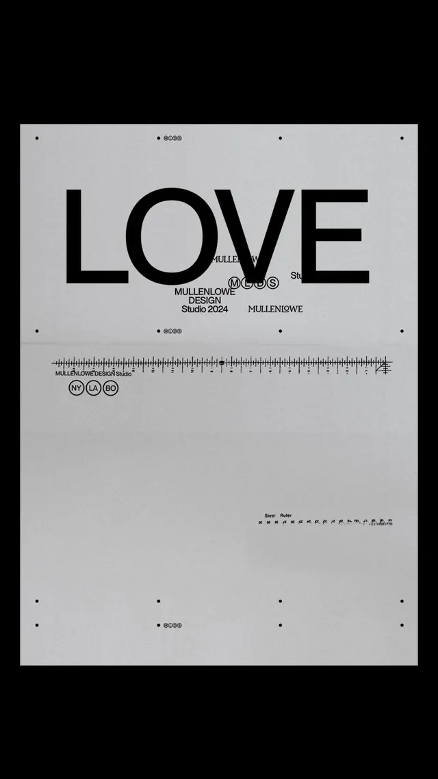
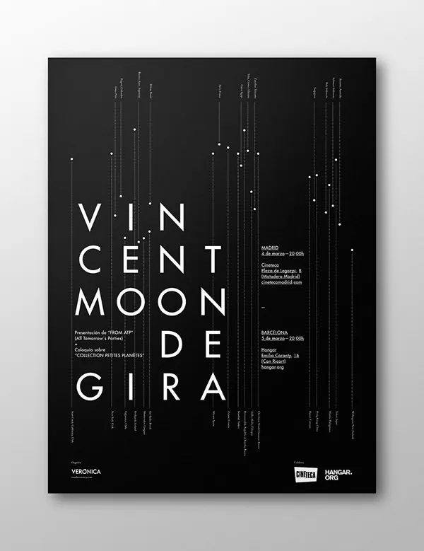
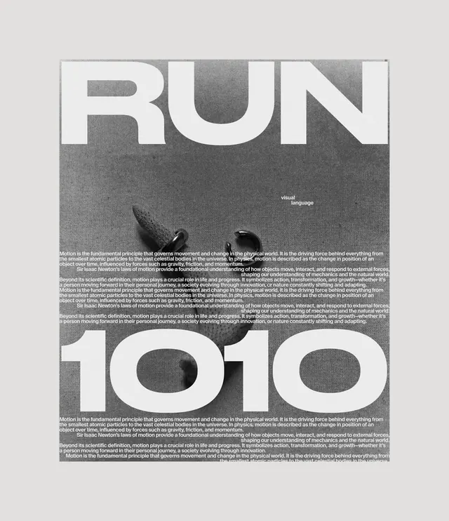
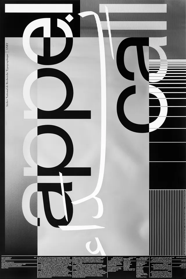
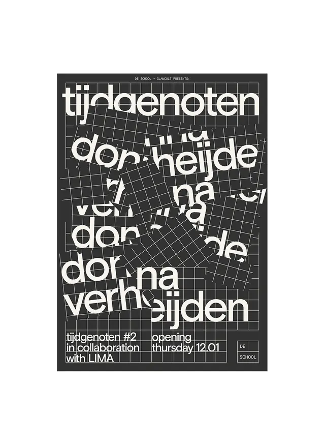
Black poster with distorted grid background and white display type layered at odd angles, Dutch experimental design aesthetic.
Summary
An experimental typographic poster featuring large white sans-serif headlines layered at various angles over a distorted grid pattern, classic Dutch design language.
Visual description
Dark charcoal background. A mathematical grid structure is visible underneath, warped and distorted with perspective. Large white sans-serif headline type ("tij/genoten", "don heijde", "van dor") is placed at angles across the composition, creating dynamic tension. Additional smaller text in corners includes event details. Strict monochromatic black and white palette with strong contrast.
Key takeaway
The power of combining rigid structure (the grid) with typographic chaos (angled, overlapping type). The distortion of the grid creates visual energy while maintaining technical precision. Dutch experimental design's hallmark: radical but intentional.
Reuse notes
Strong template for event posters, arts/culture promotion, or design-forward editorial. The technique works best when type is bold and substantial enough to read despite the layering. Good for audiences familiar with experimental design; may challenge readability for conservative contexts.