Preview image. Unlock full-res
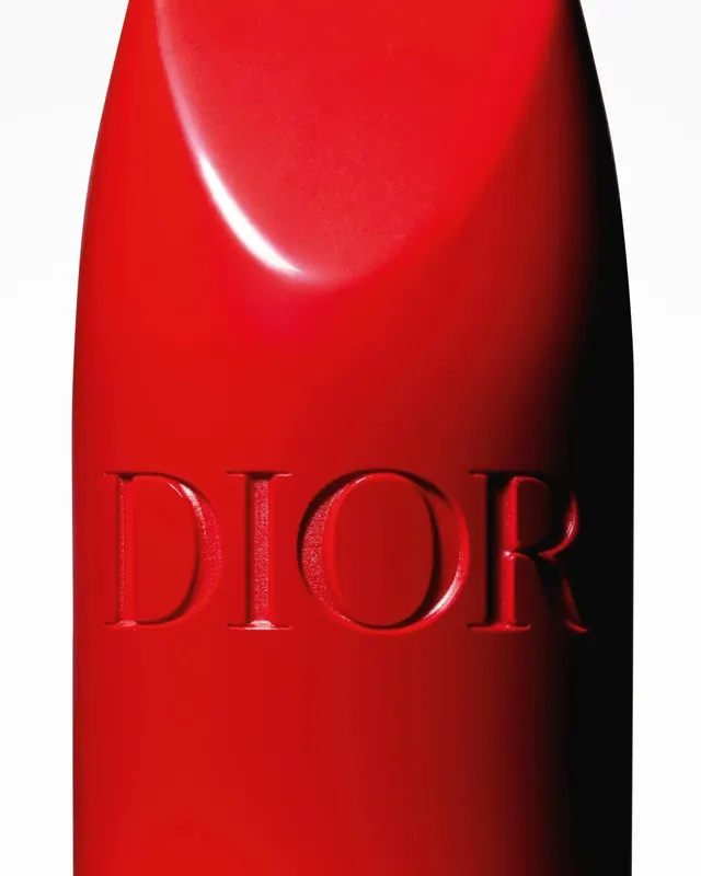
A close-up shot of a glossy red product container featuring the brand name embossed in serif typography.
Moodelegant, premium, sophisticated
Tagsglossy, embossed, monochromatic, minimalist
Palette
#FDFDFD
#C91012
#080808
#97100E
#630D0C

Summary
A close-up shot of a glossy red product container featuring the brand name embossed in serif typography.
Visual description
The image features a vibrant red, high-gloss surface with a soft light reflection on the upper curve. The wordmark 'DIOR' is centered and embossed directly into the material using a classic serif typeface. The composition is a tight, vertical macro shot focusing on texture and branding.
Key takeaway
Use high-gloss finishes and embossed typography to create a sense of luxury and tactile quality.
Reuse notes
Ideal for high-end cosmetic or luxury goods branding presentations.