Preview image. Unlock full-res
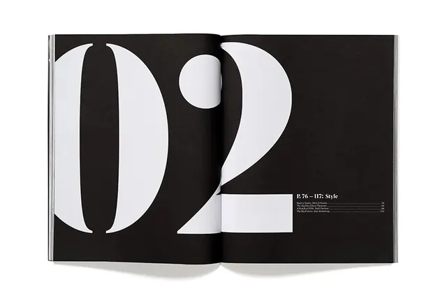
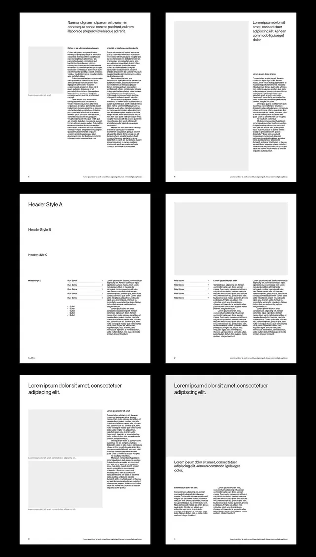
A sophisticated editorial magazine spread from AVAUNT featuring professional layout, typography hierarchy, and contemporary design sensibility.
Summary
A polished editorial magazine spread from AVAUNT demonstrating sophisticated layout design, careful typography hierarchy, and luxury publication aesthetics.
Visual description
Professional magazine spread with clear hierarchy between headlines, body text, and supporting images or graphics. Predominantly black and white or high-contrast palette emphasizing legibility and elegance. Layout appears asymmetric with careful attention to whitespace and visual balance. Professional typography mixing serif and sans-serif faces suggests editorial design expertise. High production quality and premium execution throughout.
Key takeaway
Editorial design success relies on strong hierarchy, sophisticated whitespace management, and careful typography selection. High-contrast palettes and clean layouts convey quality and professionalism.
Reuse notes
Excellent reference for editorial design, luxury branding, or sophisticated marketing materials. The typography and layout principles apply to print publications, premium websites, and design systems. Particularly strong for finance, art, architecture, or luxury industry communications. Study the hierarchy and spacing for lessons in visual organization.
More like this
Keep what you find
A free account saves references to boards and can send you a weekly email of picks based on what you save.
To see every result, go Pro.