Preview image. Unlock full-res
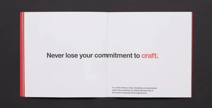
An open book spread with a compelling headline about craft in red, paired with a supporting mission statement on a right page with a red spine and neutral background.
Summary
A two-page editorial spread from RGA's brand or principles document, featuring a bold headline about craft commitment in dark and red type on the left page, with supporting copy and a red binding spine on a neutral background.
Visual description
The left page is dominated by a centered sans-serif headline in dark grey: "Never lose your commitment to craft," with the final word "craft" set in a bold red accent. Below it on the right page is smaller justified body copy explaining why craftsmanship across disciplines matters. The layout is symmetrical and book-like, with a prominent red spine running along the gutter. The color palette is intentional: blacks, whites, neutrals, and one strategic red callout. All typography is clean and legible—no flourishes, pure hierarchy and contrast.
Key takeaway
How to use a single accent color (red) to draw focus to a key value (craft) in a spread. The two-page format creates space for the headline to breathe and the supporting statement to gain weight. Binding spine as a design element (not just structure) is elegant and corporate.
Reuse notes
Reference for brand principle documents, agency manifestos, and corporate values campaigns. The red-on-white hierarchy is strong and reproducible. Works well for B2B or professional services that want to assert values without being preachy. The centered-then-justified layout pattern is easily adaptable to other single-word callouts or short values statements.
More like this
Keep what you find
A free account saves references to boards and can send you a weekly email of picks based on what you save.
To see every result, go Pro.