Preview image. Unlock full-res
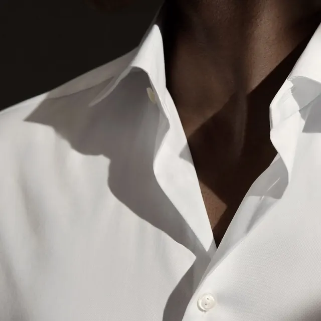
A high-contrast, close-up photograph of a person wearing a crisp white button-down shirt, focusing on the collar and neckline area.
Summary
A high-contrast, close-up photograph of a person wearing a crisp white button-down shirt, focusing on the collar and neckline area.
Visual description
The image features a sharp diagonal shadow cast across a white fabric shirt. The subject is a person's neck and collar, captured in a tight, high-contrast composition with deep shadows and bright highlights.
Key takeaway
Use dramatic, high-contrast lighting and sharp shadows to create a sense of luxury and depth in product photography.
Reuse notes
Ideal for high-end fashion lookbooks or lifestyle branding that emphasizes texture and sophisticated lighting.
More like this


Keep what you find
A free account saves references to boards and can send you a weekly email of picks based on what you save.
To see every result, go Pro.