Preview image. Unlock full-res
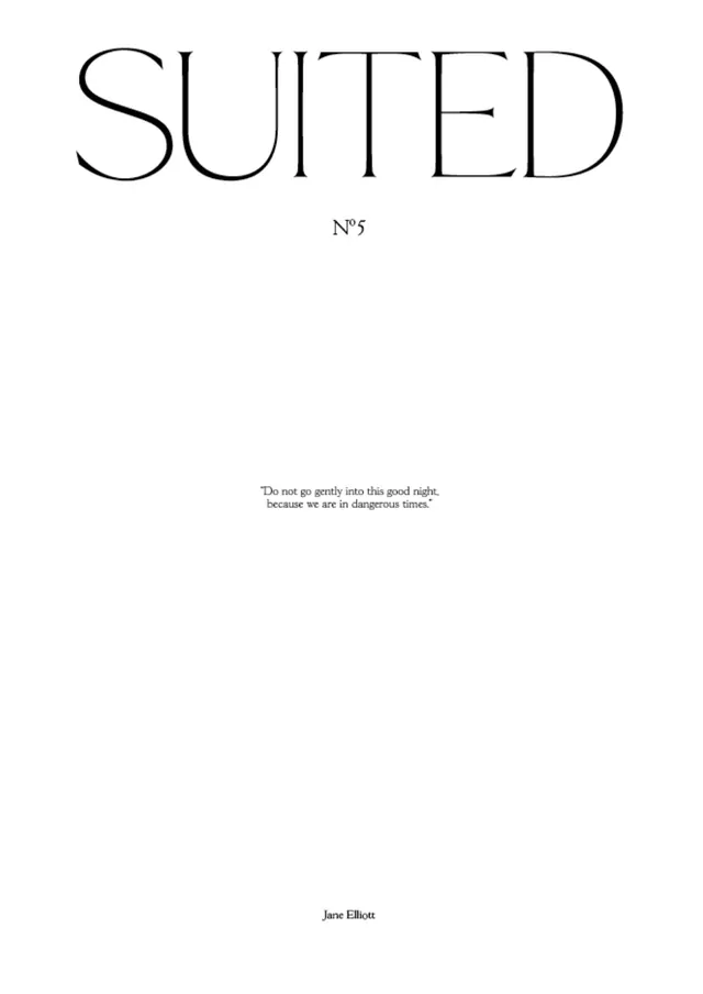
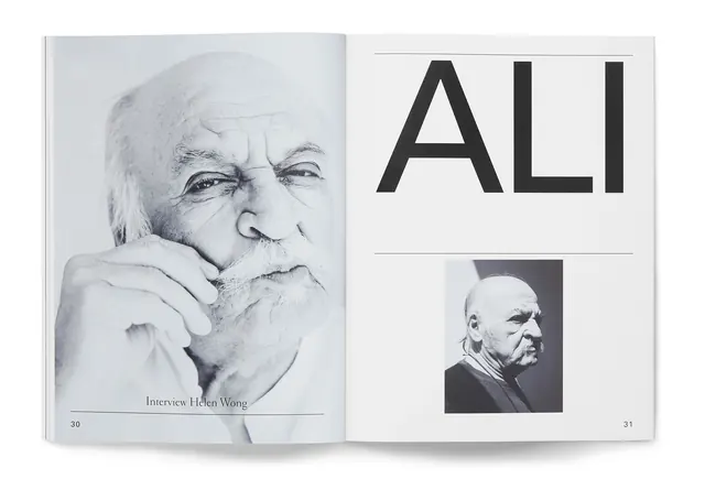
Minimalist editorial design featuring clean type treatment and restrained color palette for magazine cover.
Summary
A magazine cover design emphasizing typographic clarity and minimal color, employing Swiss design principles of grid, hierarchy, and restraint. The composition prioritizes legibility and sophistication through clean type arrangement.
Visual description
The cover features a predominantly light background (cream, white, or very pale neutral) with black and possibly one accent color used sparingly for emphasis. Typography is the dominant visual element, likely using a clean sans-serif (possibly condensed) in varying sizes to establish hierarchy. The layout appears grid-based and balanced, with ample whitespace allowing the type to breathe. There is minimal imagery—if present, it is likely restricted to black and white or very muted color. The overall feeling is magazine-editorial, aspirational, and professionally composed.
Key takeaway
Swiss-style minimalism applied to editorial covers: type is the hero, whitespace is respected, and color is deployed strategically rather than decoratively. This approach communicates sophistication and clarity, letting the content speak for itself.
Reuse notes
Appropriate for high-end editorial, luxury branding, or any context where understatement reads as sophistication. Pairs well with serious, concept-driven photography or large-format imagery. The condensed sans-serif may limit flexibility with longer copy, so best suited to clean, tagline-forward messaging.
More like this

Keep what you find
A free account saves references to boards and can send you a weekly email of picks based on what you save.
To see every result, go Pro.