Preview image. Unlock full-res
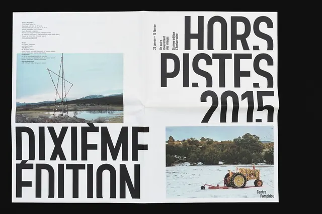
A graphic poster for 'Hors Pistes 2015' featuring large-scale typography and two landscape photographs.
Summary
A graphic poster for 'Hors Pistes 2015' featuring large-scale typography and two landscape photographs.
Visual description
The layout uses a strong grid with oversized, condensed sans-serif type for 'HORS PISTES 2015' and 'DIXIÈME ÉDITION'. Two rectangular photographs—one showing a tall structure by water and another showing a tractor in a snowy field—are placed in the corners, creating a balanced but asymmetrical composition.
Key takeaway
Use extreme scale contrast between massive typography and small photographic elements to create a high-impact visual hierarchy.
Reuse notes
Ideal for event posters, exhibition branding, or editorial covers where bold typographic expression is required.