Preview image. Unlock full-res
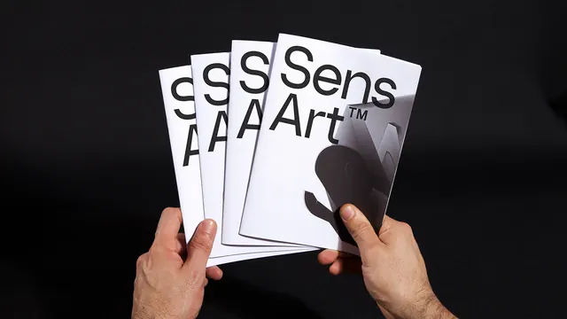
Four white brochure covers fanned out in hands against black, each cover carrying a huge black sans-serif wordmark and a grayscale sculptural photo.
Summary
A pair of hands fans four identical white brochures against a black background; the fanning progressively crops the covers' oversized two-line wordmark into pure letterform fragments.
Visual description
Landscape studio shot, black textured backdrop. Two hands hold four A5-ish white saddle-stitched brochures spread like playing cards. The front cover sets a two-line black sans-serif wordmark with a small trademark symbol, upper-left aligned at enormous scale; the lower-right quadrant holds a grayscale photograph of an abstract paper-sculpture form that bleeds off the edge. Each brochure behind shows less of the same cover, reducing the wordmark to single cropped letters. Strict black-and-white palette; skin tones are the only warmth in frame.
Key takeaway
An oversized cover wordmark survives — even benefits from — cropping: the fanned stack turns repetition into a graphic pattern and proves the identity works at fragment scale. The type-plus-one-photo cover formula is maximally simple and confident.
Reuse notes
Reference for brochure and catalog cover systems, identity presentations, and print-collateral photography. The fanned-in-hand shot is a strong way to present multiples of one printed piece. The formula needs a distinctive wordmark; weak type has nowhere to hide at this scale.
More like this


Keep what you find
A free account saves references to boards and can send you a weekly email of picks based on what you save.
To see every result, go Pro.