Preview image. Unlock full-res
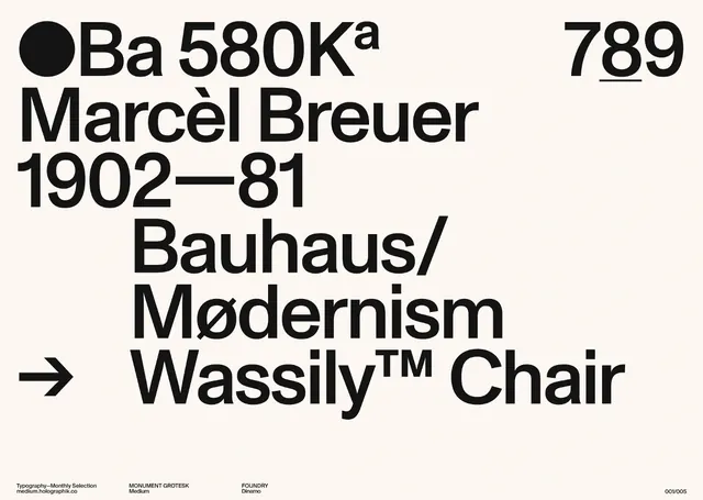
A typographic poster or type specimen page featuring information about designer Marcèl Breuer, his dates, and the Wassily™ Chair.
Summary
A typographic poster or type specimen page featuring information about designer Marcèl Breuer, his dates, and the Wassily™ Chair.
Visual description
The composition uses heavy, black sans-serif typography against a light cream background. Text is arranged in a structured, asymmetrical grid with varying scales, including large numbers and names. Graphic elements include a solid black circle and a right-pointing arrow.
Key takeaway
Use extreme typographic scale and a strict grid to create hierarchy and visual impact without imagery.
Reuse notes
Ideal for editorial layouts, museum exhibition signage, or high-end brand identity presentations.
More like this
Keep what you find
A free account saves references to boards and can send you a weekly email of picks based on what you save.
To see every result, go Pro.