Preview image. Unlock full-res
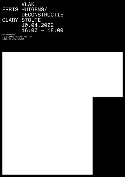
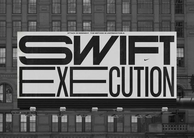
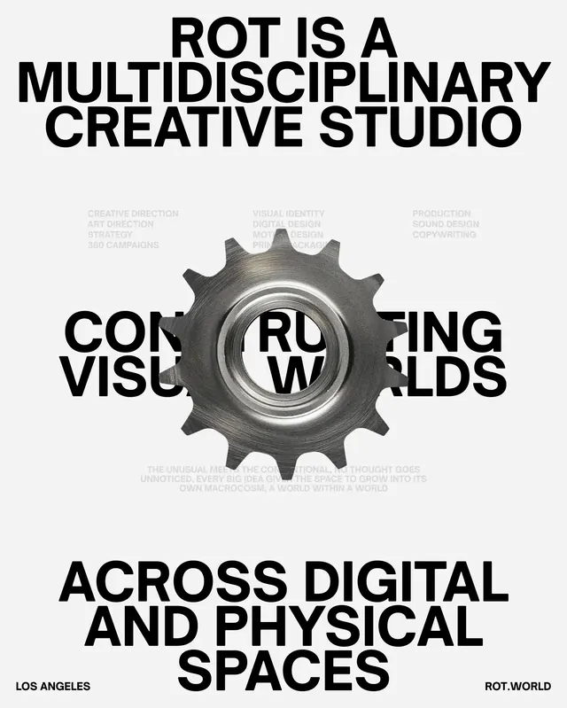
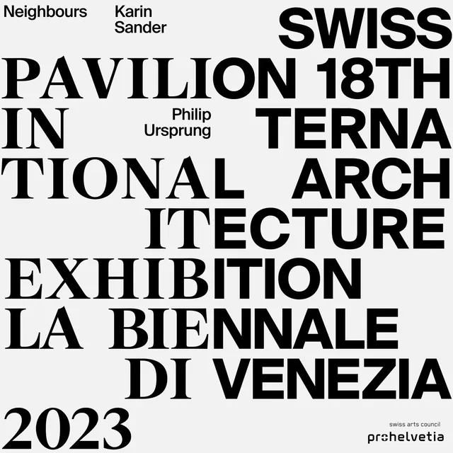
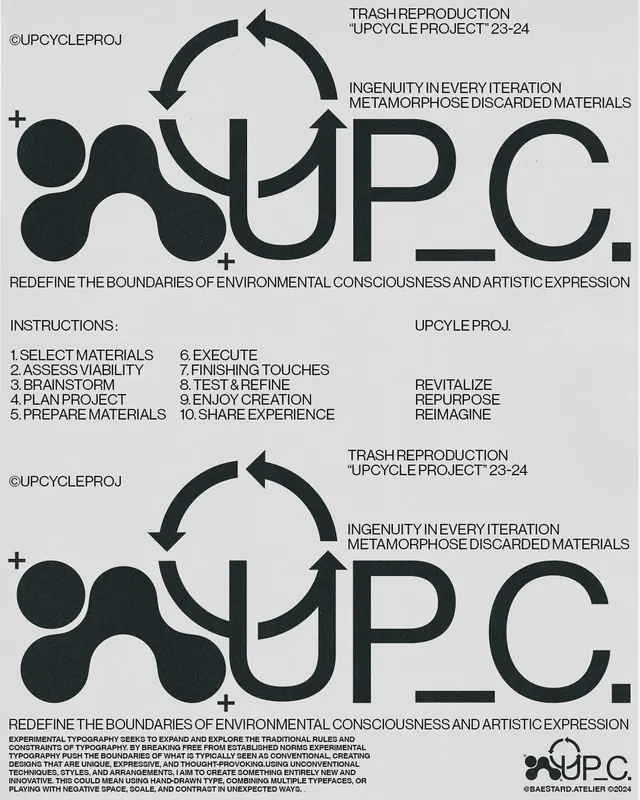
A high-contrast monochrome poster with dense typography exploring themes of material reuse and iteration in design.

Summary
A high-contrast monochrome poster featuring dense, bold typography that explores concepts of upcycling and material metamorphosis through typographic layering.
Visual description
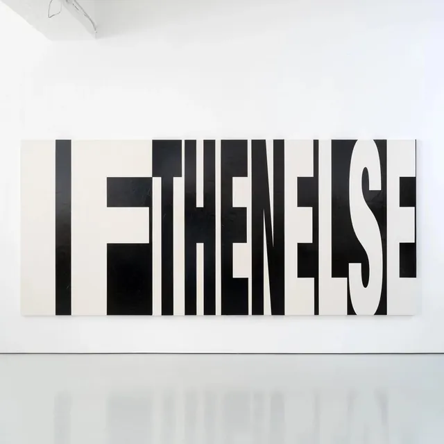
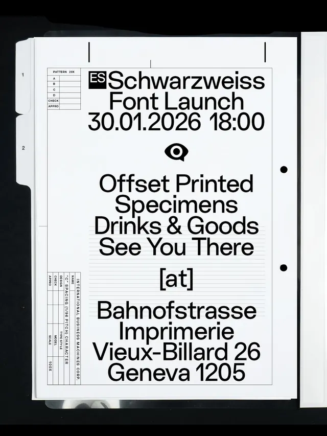
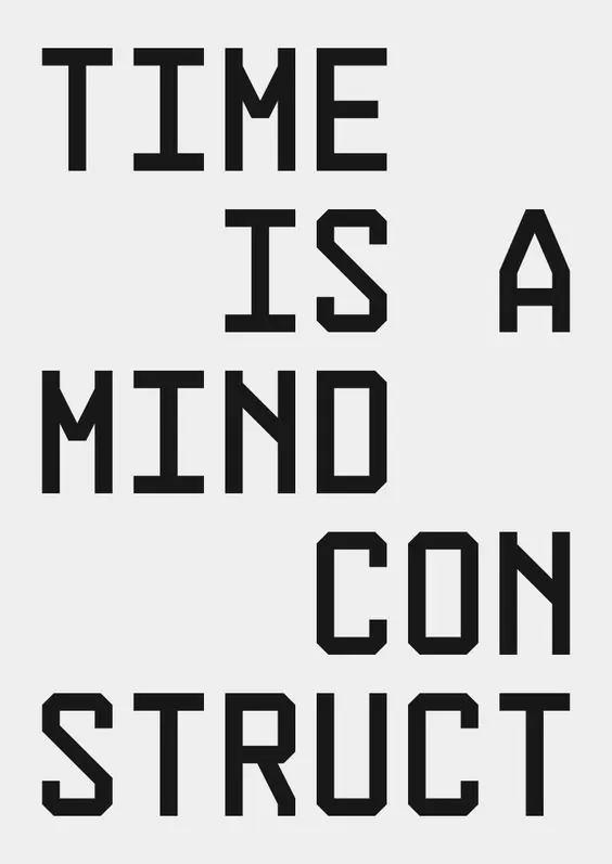
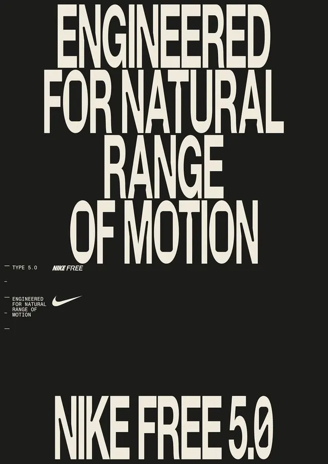
The composition uses a stark black (#2C3333) and white (#D9D9D9) palette with no intermediate tones. Text is tightly packed and layered, with varying sizes and weights creating visual hierarchy. The typography treatment is experimental and energetic, with words overlapping and breaking across the composition. Phrases related to upcycling and design iteration are repeated and fragmented, suggesting transformation and process. The overall effect is dense, high-energy, and conceptually driven.
Key takeaway
The monochrome, high-contrast approach paired with dense typography creates visual impact and draws attention to the message itself rather than ornamental design. The layering technique effectively conveys the concept of iteration and material transformation.
Reuse notes
Effective for posters, book covers, or experimental design projects. The bold typographic approach works well for communication-focused design and sustainability messaging. This treatment is particularly suitable for educational or conceptual design contexts. The stark contrast ensures legibility despite complexity.