Preview image. Unlock full-res
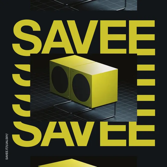
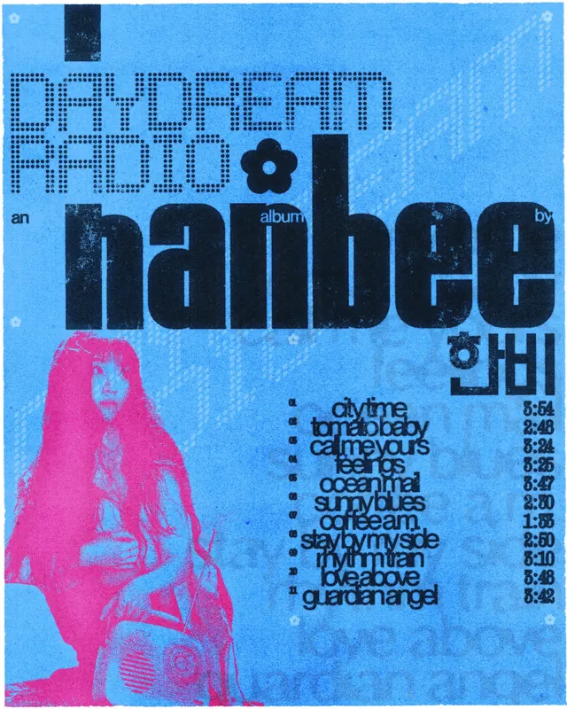
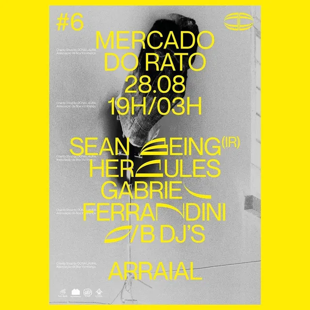
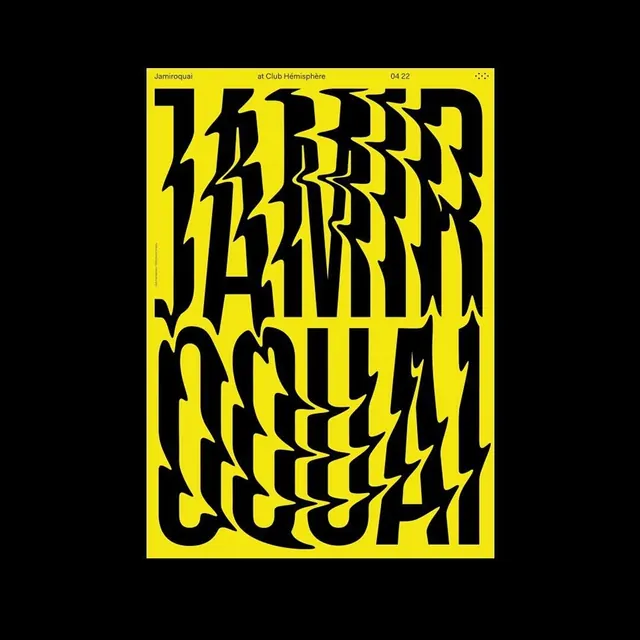
A black-on-yellow concert poster where the artist name is stacked in two rows of violently warped, zigzag-distorted capitals.

Summary
A two-color gig poster that turns the artist name into the entire composition, stretching black capitals through a jagged wave distortion until they read as texture as much as text.
Visual description
A vivid yellow poster sits centered on a black backdrop. A thin utility line of small sans-serif text runs across the top: the artist name at left, the venue in the middle, and a date at right, with a small dotted mark in the corner. Below, the artist name fills the sheet in two enormous rows of black capitals, each letter sheared by horizontal zigzag displacement so the strokes fracture into lightning-like jags. The distortion intensifies toward the middle of each row, leaving letters legible at the edges and nearly abstract at the center. A tiny vertical credit line runs along the left edge.
Key takeaway
One typographic move, pushed hard, carries the whole poster: the wave distortion turns a name into an image while the calm top info line keeps the piece functional. Restricting the palette to two colors lets the distortion stay legible.
Reuse notes
Great reference for music, festival, or nightlife posters that need energy from type alone. The quiet metadata strip plus loud display area is a reusable structure for any event graphic. Works best with short names; long words lose legibility fast under this level of distortion.