Preview image. Unlock full-res
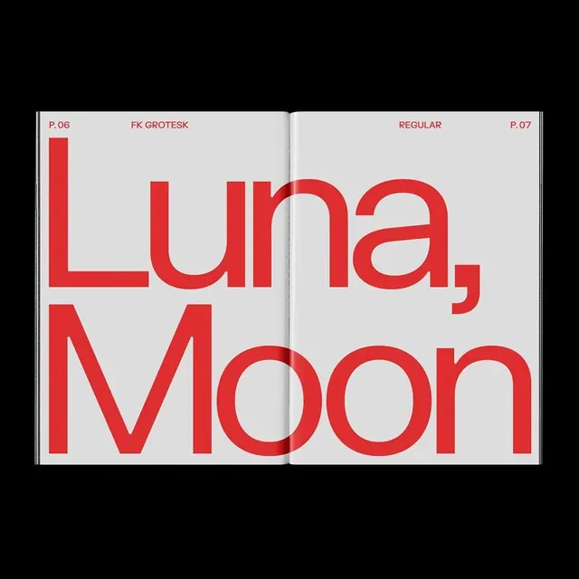
A two-page editorial spread showcasing the 'FK Grotesk' typeface in regular weight.

Summary
A two-page editorial spread showcasing the 'FK Grotesk' typeface in regular weight.
Visual description
The spread features oversized red sans-serif text reading 'Luna, Moon' against a light grey background. The text is split across two pages, with 'Luna,' on the top left and 'Moon' on the bottom, creating a strong typographic grid. Small technical details like 'P. 06', 'FK GROTESK', 'REGULAR', and 'P. 07' are placed at the margins.
Key takeaway
Use massive, high-contrast typography to create a strong visual hierarchy and immediate impact.
Reuse notes
Use this layout for bold poster designs or high-impact editorial covers where type is the primary visual element.
More like this

Keep what you find
A free account saves references to boards and can send you a weekly email of picks based on what you save.
To see every result, go Pro.