Preview image. Unlock full-res
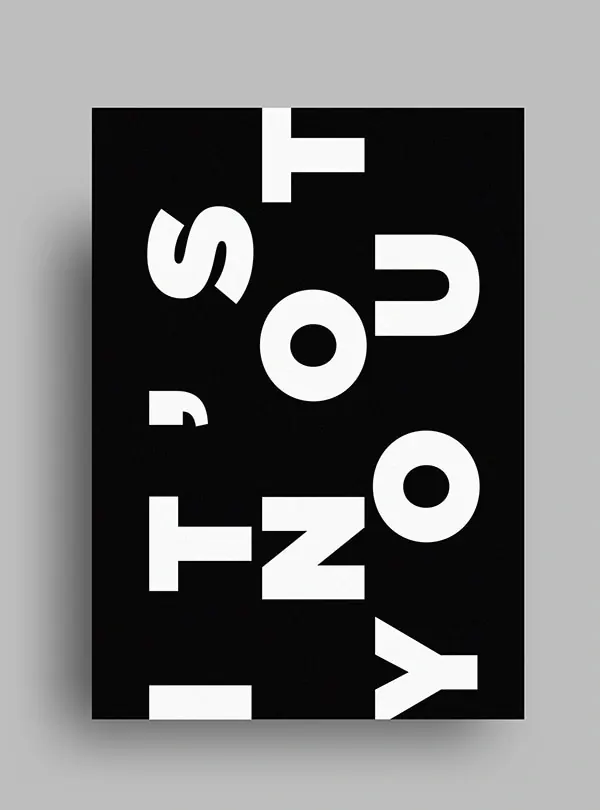
Bold white sans-serif typography reading "IT'S NOT YOU" arranged dynamically on a solid black poster.
Summary
Bold white sans-serif typography reading "IT'S NOT YOU" arranged dynamically on a solid black poster.
Visual description
A vertical black rectangle poster centered on a light gray background. Large, bold, condensed white sans-serif letters spell out "IT'S NOT YOU" in an irregular, dynamic layout: some letters stacked vertically on the left, others large and horizontal to the right and bottom. Letters vary in size and alignment for visual tension. No other graphics or imagery; pure typographic composition with generous spacing and high contrast.
Key takeaway
The expressive, oversized all-caps typography uses scale, rotation in placement, and negative space to turn a simple phrase into a striking graphic statement.
Reuse notes
Strong reference for editorial posters, title cards, or typographic branding. The monochrome and bold weight pair well with minimal layouts. Ensure ample margin when reproducing.