Preview image. Unlock full-res
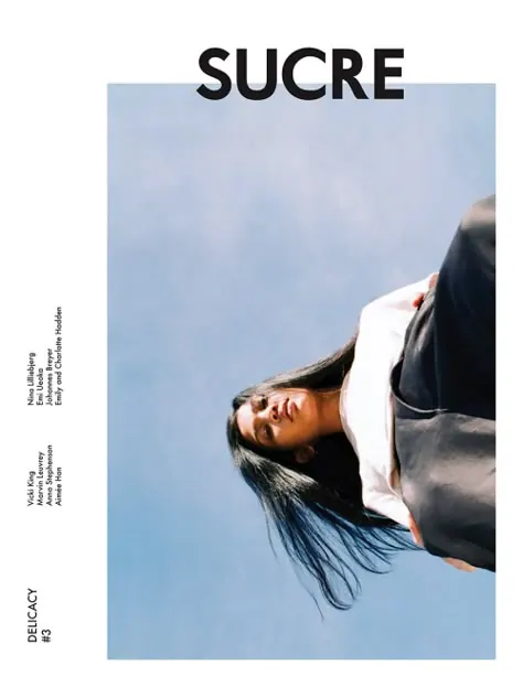
A magazine cover design featuring a portrait photograph cropped at an unusual angle, overlaid with bold geometric color blocks and minimal typography.
Summary
A contemporary magazine cover design combining a cropped portrait photo with bold geometric color blocks and the word "SUCRE" as the primary headline, creating visual tension between photographic and graphic elements.
Visual description
Rectangular vertical format (approximately 3:4 aspect). The composition is split with a large blue-gray rectangular block on the right side containing a cropped portrait of a person looking upward. The blue-gray block occupies roughly 60% of the composition. The left side is divided into smaller sections: a white area at top with the black word "SUCRE" in a bold, modern sans-serif typeface positioned above the color block, and a beige/tan section below. Editorial or publisher information is rendered vertically along the left margin in small, justified sans-serif type. The color palette is cool and restrained: whites, blacks, and muted blue-gray dominate, with warm tan accents. The portrait is cropped tightly, with the subject's face filling most of the colored block. The overall approach prioritizes geometric logic and typographic hierarchy over photographic centering.
Key takeaway
Strategic color blocking as a layout device that simultaneously frames content and creates visual division. The asymmetrical composition and the unexpected crop of the portrait (off-axis, unconventional framing) create visual interest without fussiness. The geometric approach makes the magazine feel contemporary and structured, while the portrait brings humanity and access.
Reuse notes
Strong reference for magazine cover design, editorial layouts, and how to combine photography with geometric graphic elements. Excellent template for publications seeking a modern, structured aesthetic. Use for: brand identity design systems with photographic and graphic elements, poster design combining type and image, layout systems with asymmetric divisions. The technique of cropping a portrait into a colored shape (rather than using a full rectangular container) is a design move worth studying. Good inspiration for designers learning to balance order (geometry) with organic content (portraiture).