Preview image. Unlock full-res
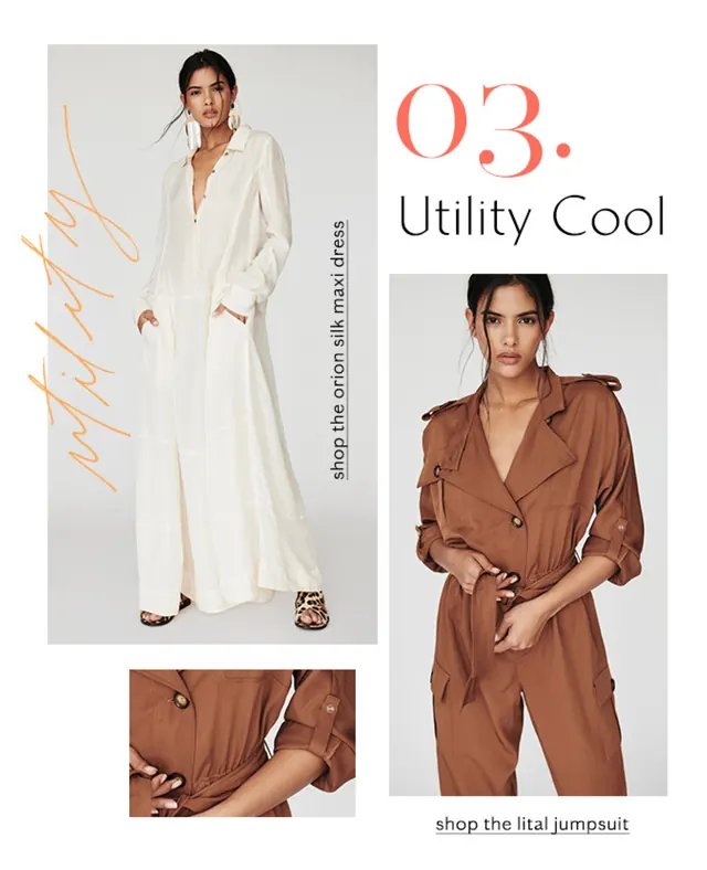
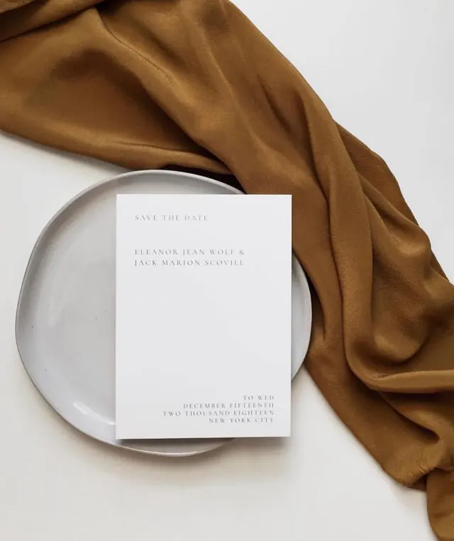
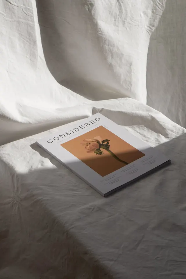
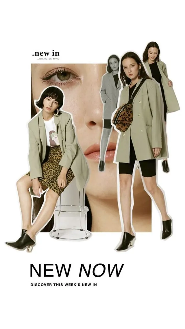
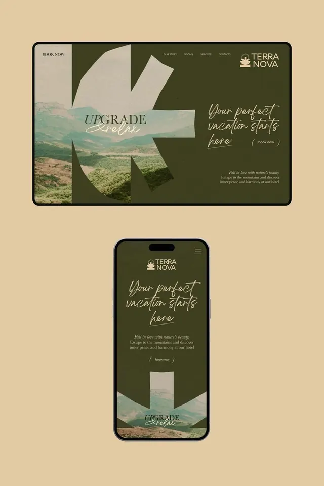
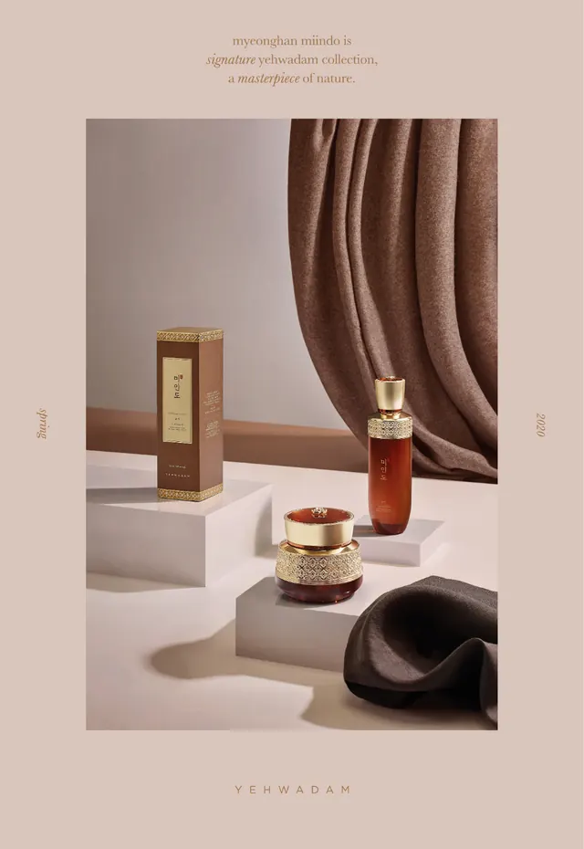
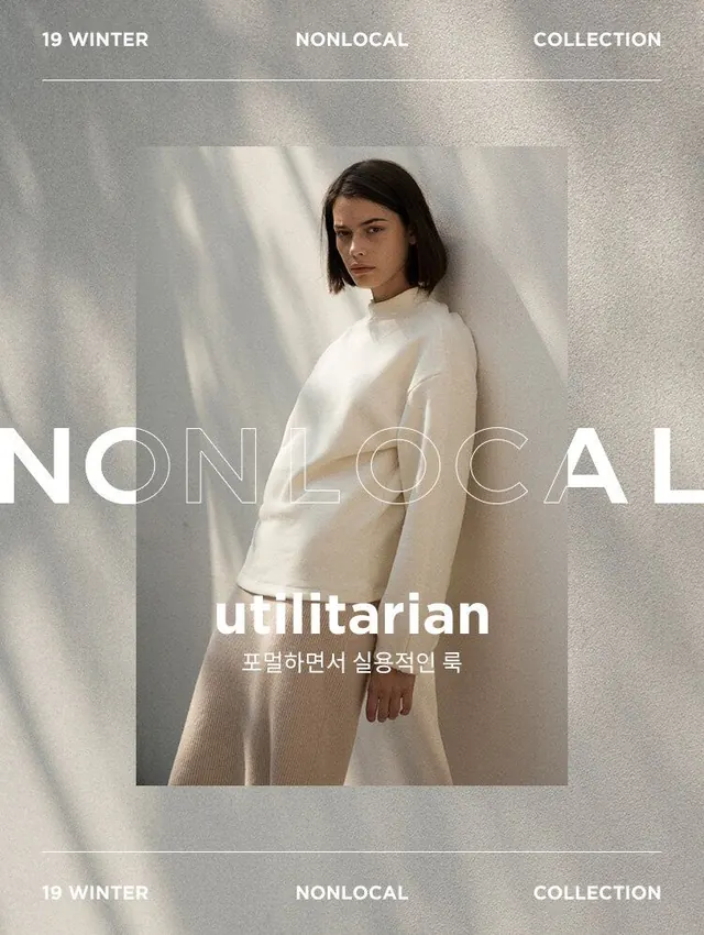
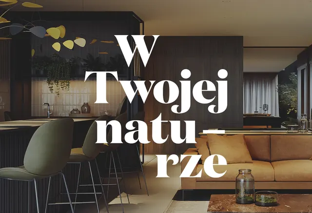
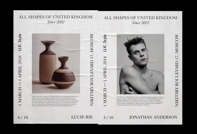
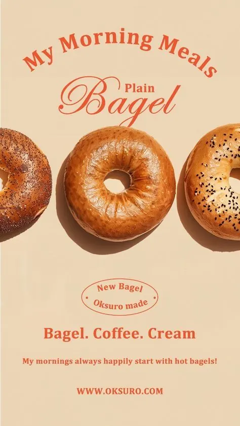
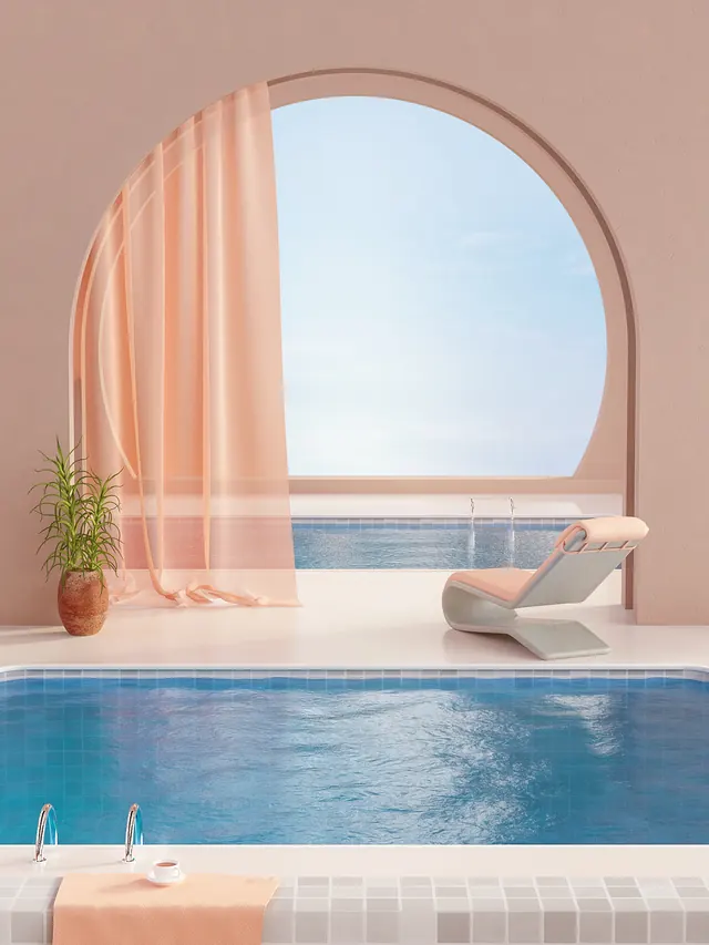
Sophisticated editorial or mood board featuring warm sandy tones, muted terracotta accents, and bluish highlights with balanced, luxurious aesthetic.
Summary
A luxury editorial composition celebrating warm Mediterranean tones—sandy creams and terracottas—with strategic blue accents that suggest sky and sea, creating a balanced, travel-inspired mood board.
Visual description
Warm beige and cream (#C9BAB5) dominate at approximately 89% of the composition, establishing a unified, sophisticated base. Teal-blue accents (#447F9C) provide cool contrast at roughly 8%, suggesting sky or water. Burnt orange and salmon tones (#856535, #BA836A) add warmth and complexity in small amounts. The vertical format and color balance create an editorial, mood-board-like aesthetic suggesting summer travel or luxury lifestyle.
Key takeaway
Warm monochromatic palettes with strategic cool accents create sophisticated, harmonious designs that feel premium and aspirational. The restraint in accent colors ensures they read as highlights rather than competing focal points.
Reuse notes
Ideal reference for travel, lifestyle, or luxury editorial design. The warm-with-cool-accents approach works well for magazine layouts, brand mood boards, hospitality design, or resort/vacation marketing. The balanced color use suits photography-heavy layouts and editorial spreads. Pairs effectively with clean typography and generous white space.