Preview image. Unlock full-res
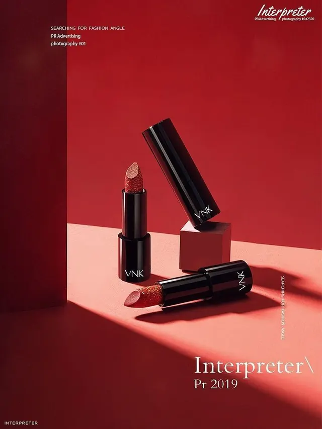
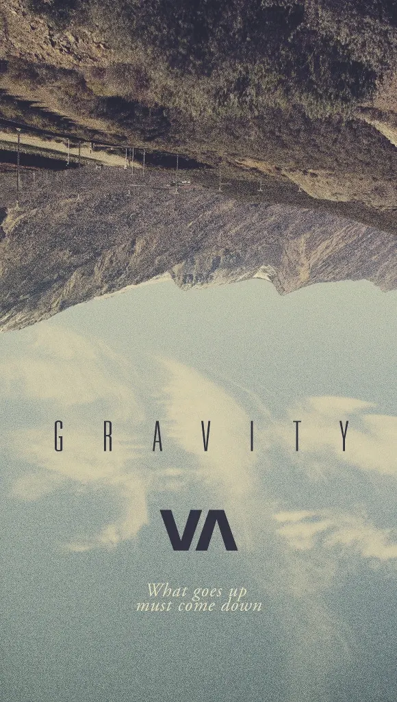
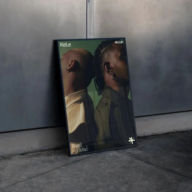
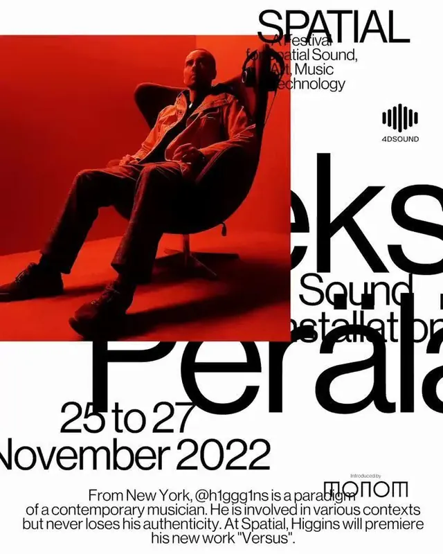
Angled magazine or catalog cover with layered depth using oversized sans-serif typography and warm-to-teal color gradient photography.
Summary
An editorial print cover using angled perspective and layered composition to create dynamic depth, anchored by bold sans-serif type overlaying teal, tan, and dark tones.
Visual description
The composition is angled at roughly 20 degrees from horizontal, creating a forward-leaning energy. Large white sans-serif letterforms spell what appears to be a title or publication name, positioned to cut diagonally across layered abstract photography. The background shifts from warm terracotta and tan at the bottom through cool teals and dark charcoals toward the top, with soft organic gradients blending the zones. Text is crisp and bold against the color shifts, suggesting editorial sophistication. The angled perspective implies the item is a page or cover tilted in space.
Key takeaway
The angle itself is the design move: it adds kinetic tension to a static surface and makes a simple color-gradient background feel architecturally composed. The white type sits confidently across the gradient without losing legibility.
Reuse notes
Strong pattern for editorial covers, catalogs, and gallery announcements. The teal-to-tan palette is earthy and contemporary. Only works when the angled composition does not obscure critical text; reserve for items where the angle reinforces the message.