Preview image. Unlock full-res
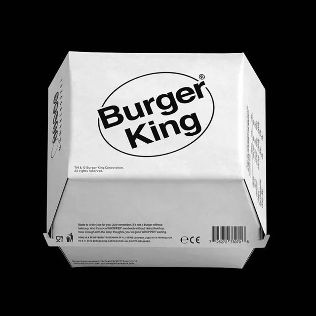
Minimalist fast-food packaging mockup showing the iconic Burger King oval logo and tagline against a clean white surface, emphasizing geometric simplicity and brand recognition.
Summary
A reimagined fast-food packaging design presenting the Burger King brand through a stark, minimalist lens with the iconic oval logo and supporting typography rendered in bold black against clean white, exemplifying geometric clarity and strong brand presence.
Visual description
White packaging box photographed against a black background, shown at a slight three-quarter angle to reveal the front and side panels. The front features the Burger King oval logo and wordmark in bold black sans-serif at the center-top, positioned horizontally. Below the logo, small text reads "Made to order just for you. Just remember, it's not a burger without 'em." A barcode and certification marks appear in the lower right. Side panels show additional small text and regulatory information. The overall treatment is clean and contemporary, with generous white space allowing the logo to dominate. Typography hierarchy is clear: the logo is the primary element, with descriptive copy in smaller sans-serif supporting it.
Key takeaway
The effectiveness of centered, large-scale logo placement combined with clean white space to reinforce brand strength and recognition. The minimal color palette (black, white) ensures the mark remains the focal point while the descriptive copy provides personality and messaging without visual clutter. This approach is timeless for package design.
Reuse notes
Strong default for quick-service restaurant rebranding or product packaging modernization. Works especially well when the existing brand mark is iconic and recognizable. The minimal approach suits efficiency-focused messaging and contemporary design sensibilities. Ensure supporting typography is genuinely valuable to the consumer; unnecessary copy reduces the impact of the simplified design.