Preview image. Unlock full-res
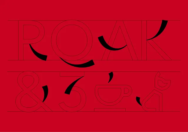
A high-contrast, two-tiered typographic composition featuring the wordmark 'ROAK' above the characters '& Co' with abstract black curved shapes.
Summary
A high-contrast, two-tiered typographic composition featuring the wordmark 'ROAK' above the characters '& Co' with abstract black curved shapes.
Visual description
The design features the word 'ROAK' in large outlined sans-serif letters on a red background, with '& Co' positioned below it. Black, thick, curved strokes are scattered across the composition, intersecting the letterforms. The layout is structured by thin horizontal lines that divide the two rows of text.
Key takeaway
Use high-contrast, organic curved shapes to break up rigid, geometric typography for a sense of movement.
Reuse notes
Use this style for bold brand identities or editorial posters that require a striking, modern aesthetic.