Preview image. Unlock full-res
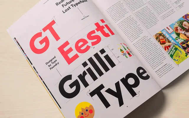
Magazine editorial layout featuring oversized sans-serif type and colorful imagery showcasing typography treatments.
Summary
A magazine spread with bold red sans-serif headlines exploring typography and layout, including body text columns and small product photography on the right.
Visual description
The layout places large red letterforms (GT Eesti, Grilli Type, references to typography) against a light beige background. Black body text fills columns alongside playful illustrations and food photography samples. The design demonstrates hierarchy, white space management, and color accent usage—the vibrant red creates a clear focal point contrasting the neutral palette.
Key takeaway
The effective use of a single bright accent color (red) to create visual hierarchy and guide the eye through dense editorial layout.
Reuse notes
Useful for editorial design systems, magazine layouts, or projects needing bold typography treatments with controlled color. Good reference for balancing text-heavy layouts with visual breathing room.
More like this
Keep what you find
A free account saves references to boards and can send you a weekly email of picks based on what you save.
To see every result, go Pro.