Preview image. Unlock full-res
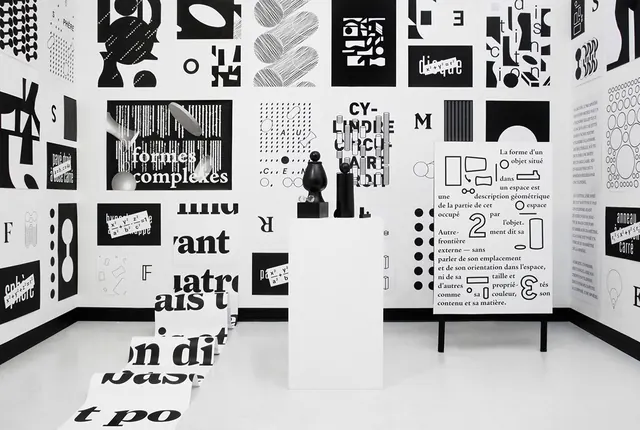
A black and white art installation featuring walls covered in large-scale graphic patterns and text, with sculptural objects on pedestals in a gallery setting.
Summary
A black and white art installation featuring walls covered in large-scale graphic patterns and text, with sculptural objects on pedestals in a gallery setting.
Visual description
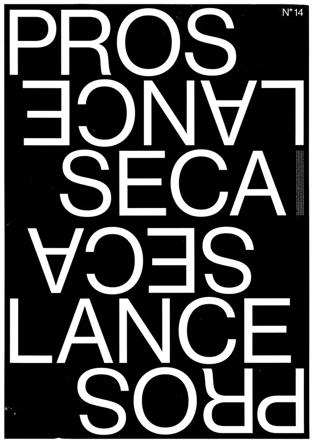
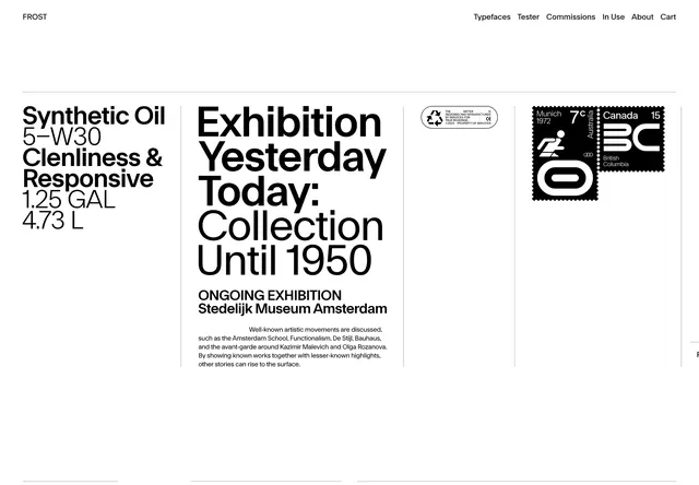
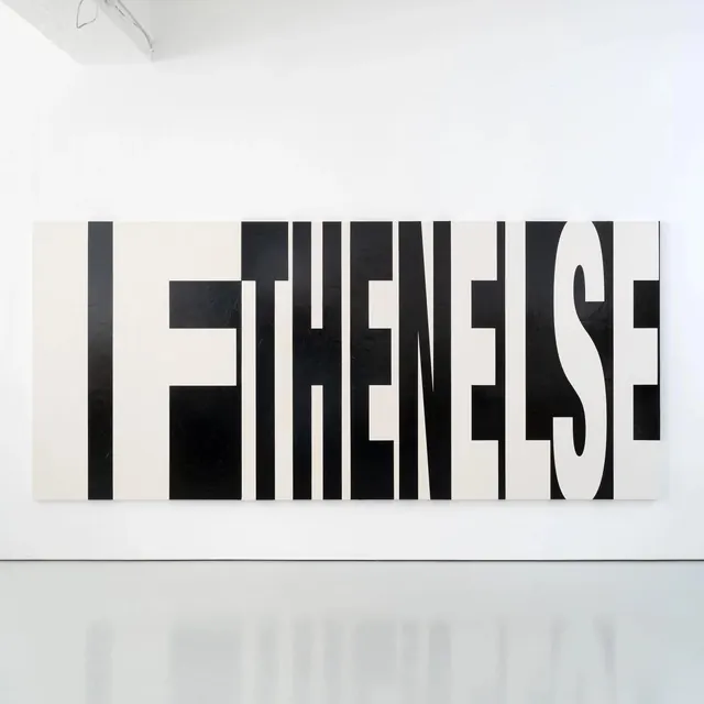
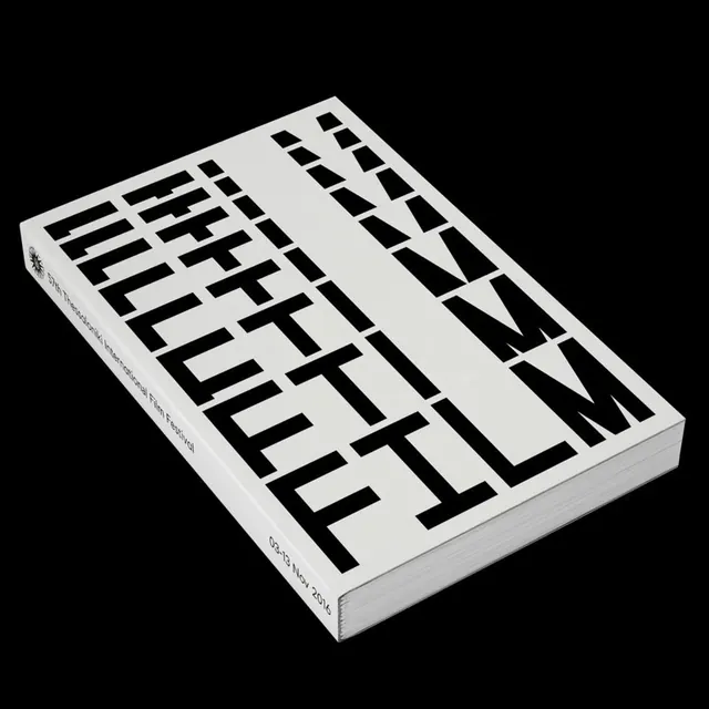
The space is dominated by high-contrast black and white patterns consisting of large letters and geometric shapes. Sculptural black forms sit on white pedestals amidst walls covered in dense typographic layouts. The arrangement uses extreme scale shifts between tiny text and oversized letterforms.
Key takeaway
Use extreme scale contrast and high-contrast monochrome palettes to create a bold, immersive typographic environment.
Reuse notes
Reach for this style when designing immersive brand experiences, experimental editorial layouts, or high-impact exhibition spaces.
More like this
Keep what you find
A free account saves references to boards and can send you a weekly email of picks based on what you save.
To see every result, go Pro.