Preview image. Unlock full-res
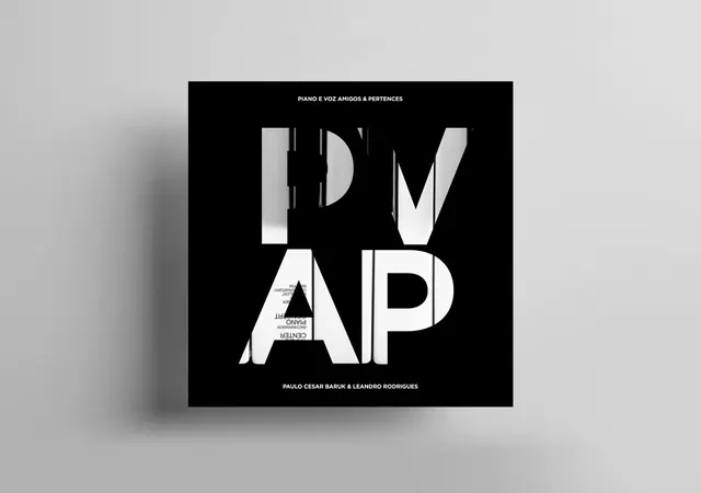
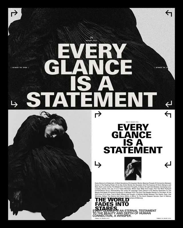
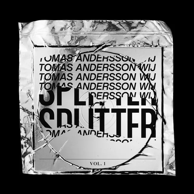
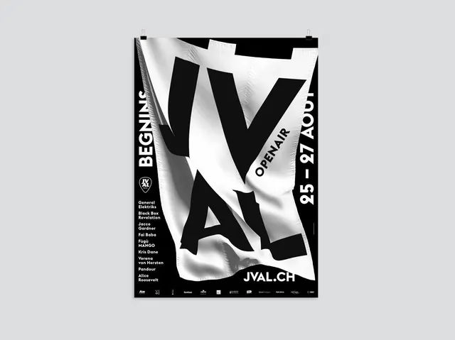
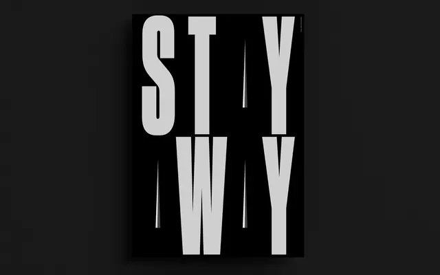
A high-contrast, monochrome typographic poster featuring the words 'STAY' and 'WY' in a vertically stacked, condensed layout.
Styleminimal, brutalist, monochrome, typographic, experimental
Colordark, high-contrast, monochrome
Typesans-serif, condensed, all-caps, oversized
Industryentertainment, fashion, music
Palette
#141414
#CFCFCF
Summary
A high-contrast, monochrome typographic poster featuring the words 'STAY' and 'WY' in a vertically stacked, condensed layout.
Visual description
The design features large, light-grey condensed sans-serif letters against a solid black background. The text is arranged in two rows, with 'STAY' on top and 'WY' below, separated by thin vertical white lines that create a sense of rhythm and verticality.
Key takeaway
Use extreme vertical stretching and high-contrast monochrome palettes to create a bold, rhythmic typographic impact.
Reuse notes
Ideal for music event posters, streetwear branding, or edgy editorial covers.