Preview image. Unlock full-res
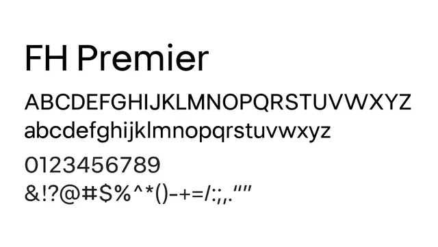
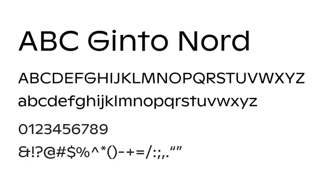
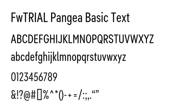
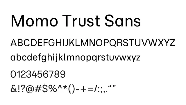
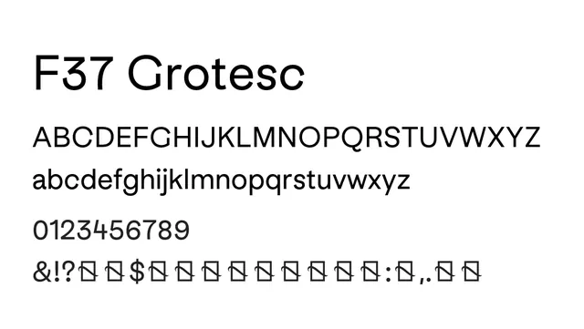
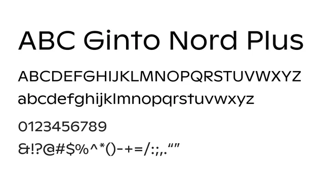
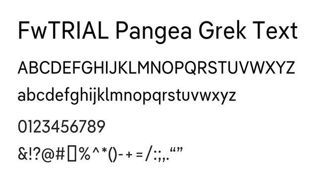
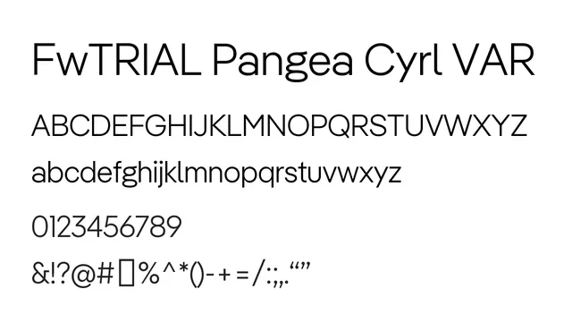
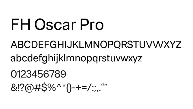
A refined geometric sans with generous letter spacing and balanced proportions, optimized for clean, modern interface design.
Typesans-serif, neo-grotesque
Summary
A refined geometric sans with generous letter spacing and balanced proportions, optimized for clean, modern interface design.
What to use it for
Ideal for contemporary UI design and tech branding where clarity and spaciousness are valued. The generous spacing reduces visual tension while maintaining legibility.
Pairing
Works well with Inter or Graphik for body copy in modern digital products.