Preview image. Unlock full-res
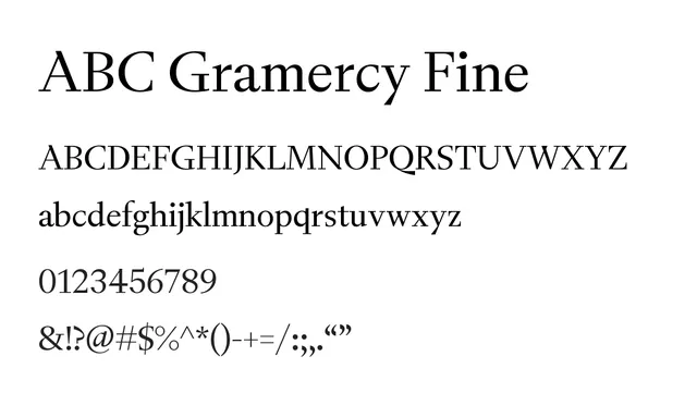
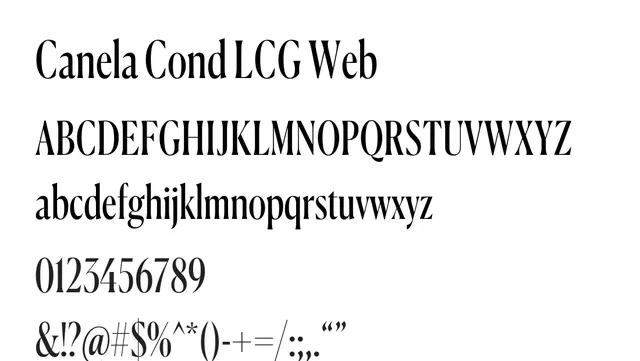
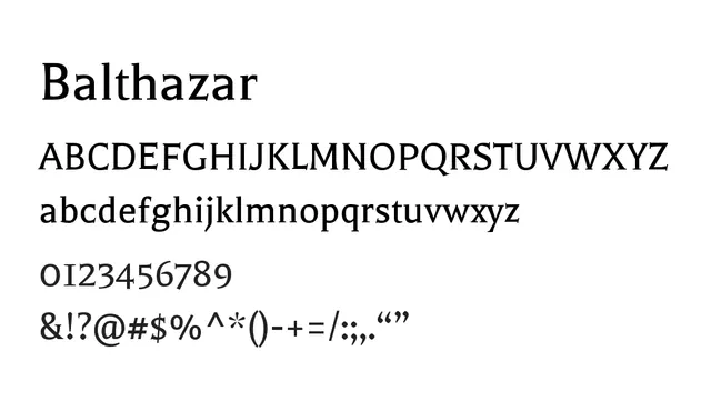
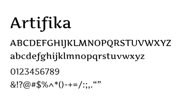
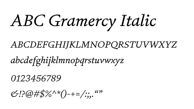
An elegantly proportioned transitional serif italic with flowing forms and high contrast, ideal for editorial emphasis and refinement.
Moodsophisticated, editorial, flowing, literary
Industryeditorial, luxury, publishing, fashion
Summary
An elegantly proportioned transitional serif italic with flowing forms and high contrast, ideal for editorial emphasis and refinement.
What to use it for
Perfect for italic emphasis within editorials, poetry, and literary publications. The graceful stress and flowing letterforms add sophistication to body text and pull-quotes.
Pairing
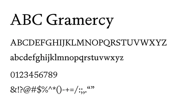
Pairs naturally with the upright ABC Gramercy for comprehensive editorial systems, or with clean sans-serif for contrast.