Preview image. Unlock full-res
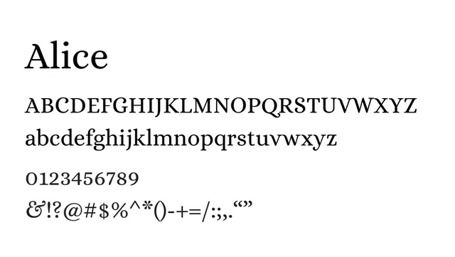
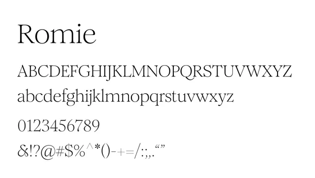
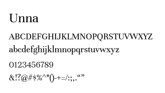
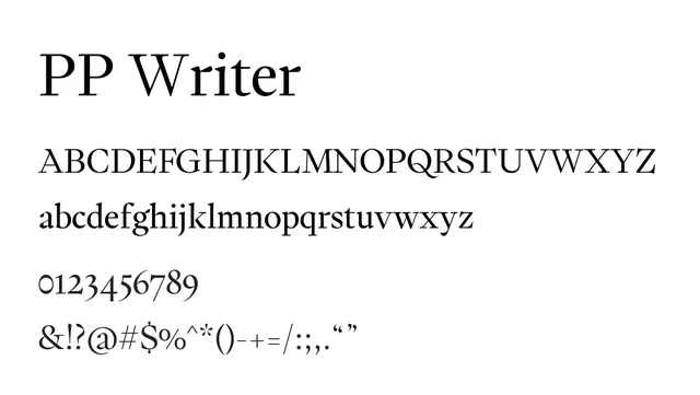
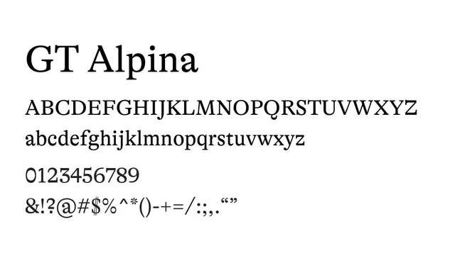
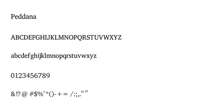
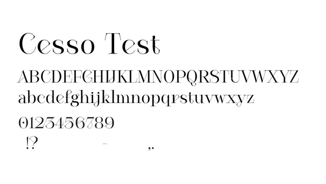
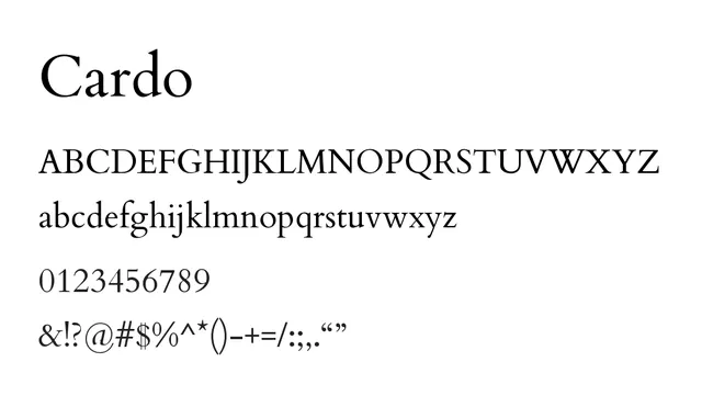
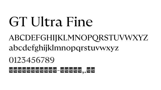
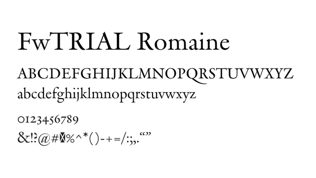
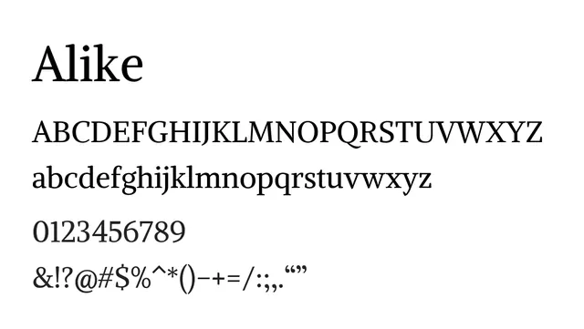
A refined transitional serif with elegant geometric serifs, combining classical proportions with modern sensibility for editorial excellence.
Typeserif, transitional
Moodsophisticated, warm, literary, traditional
Industryeditorial, publishing, fashion, literary, luxury
Summary
A refined transitional serif with elegant geometric serifs, combining classical proportions with modern sensibility for editorial excellence.
What to use it for
Excellent for book and magazine body text. The high x-height, generous spacing, and balanced serifs ensure superior readability in long-form editorial applications.
Pairing
Complements geometric sans-serifs like Avenir or humanist sans like Graphik for sophisticated editorial design.