Preview image. Unlock full-res
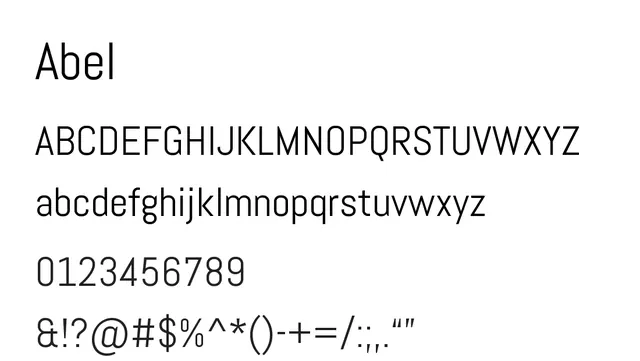
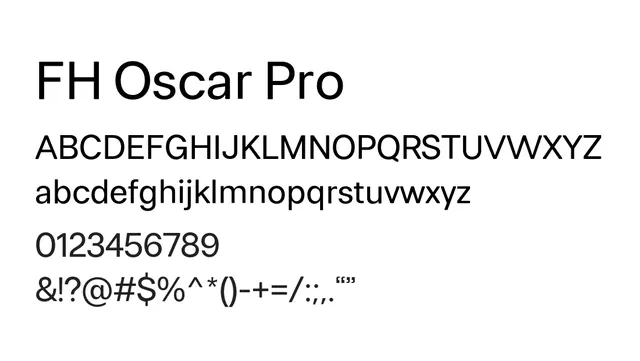
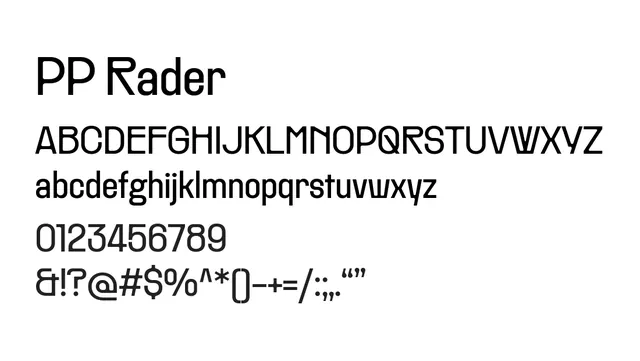
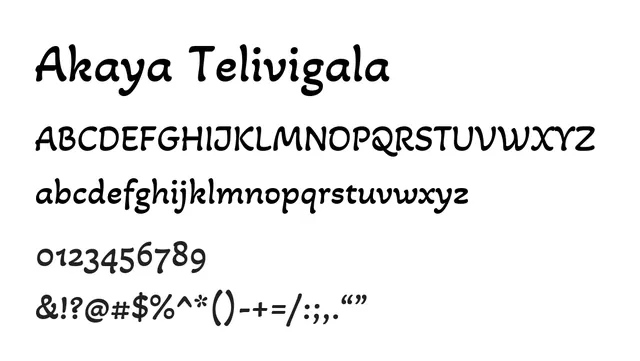
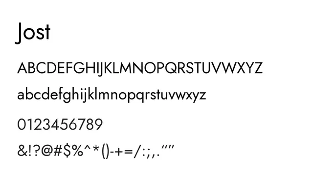
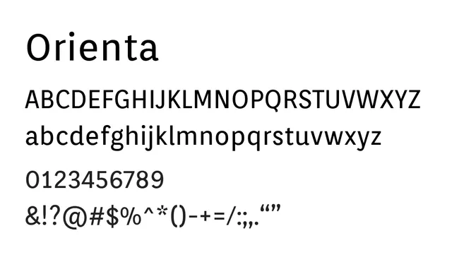
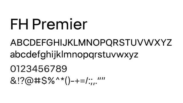
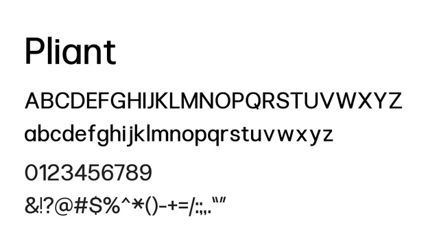
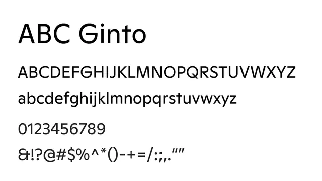
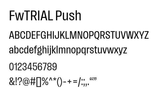
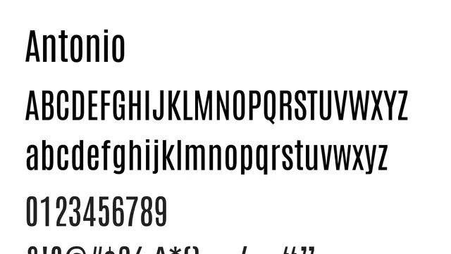
A geometric sans-serif with clean proportions and minimalist aesthetics that conveys modernity and technical precision.
Stylemodern, clean, geometric, minimalist
Typesans-serif, geometric
Moodneutral, technical, professional, contemporary
Summary
A geometric sans-serif with clean proportions and minimalist aesthetics that conveys modernity and technical precision.
What to use it for
Best suited for display and UI applications in technology-forward brands. The geometric construction creates visual clarity and contemporary feel, making it ideal for fintech, corporate identity, or any brand wanting to communicate efficiency and innovation.
Pairing
Pair with a friendly humanist sans like Open Sans for warmth, or with a technical monospace like IBM Plex Mono for code/data contexts.