Preview image. Unlock full-res
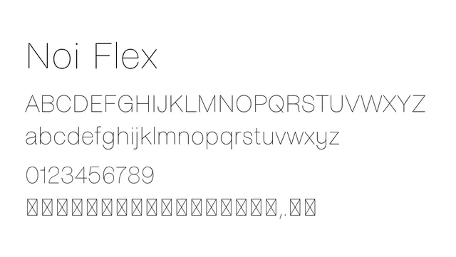
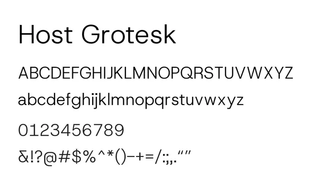
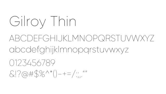
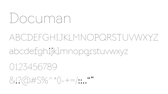
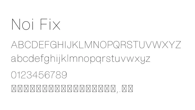
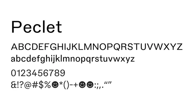
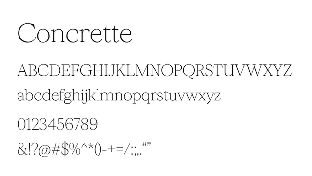
A thin, minimalist neo-grotesque sans-serif with refined proportions and low contrast, perfect for elegant modern typography.
Typesans-serif, neo-grotesque
Summary
A thin, minimalist neo-grotesque sans-serif with refined proportions and low contrast, perfect for elegant modern typography.
What to use it for
Suitable for editorial body text, brand applications, and UI design where elegance and minimalism are valued. Works well at text sizes for publications with refined aesthetic sensibilities.
Pairing
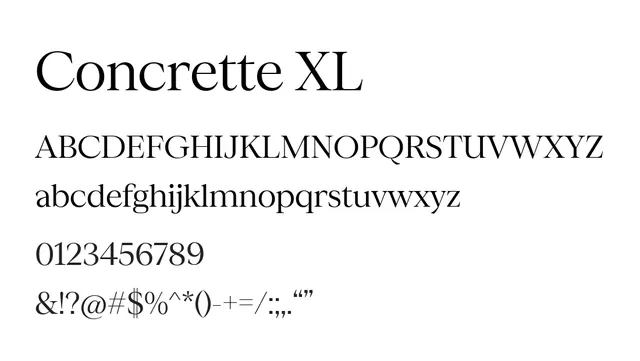
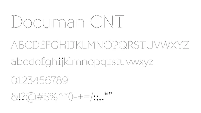
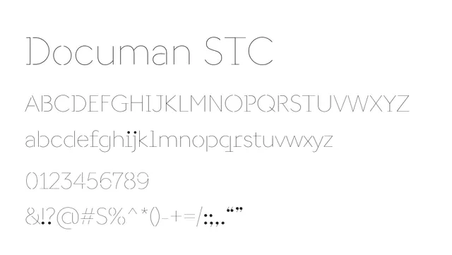
Complements Concrette Italic for editorial design, or combines with other weights in the Concrette family (M, S, XL) for a comprehensive typographic system.