Preview image. Unlock full-res
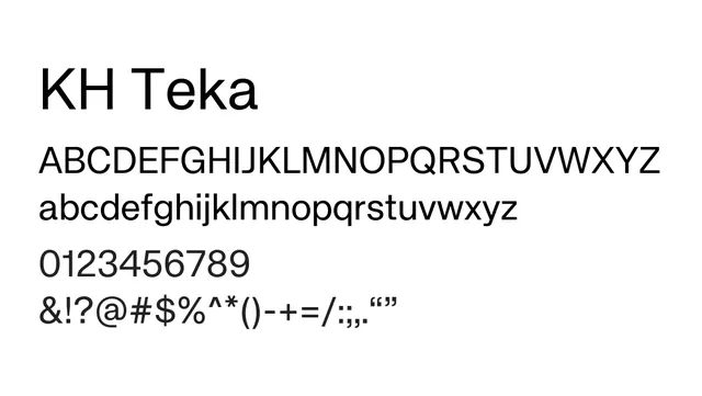
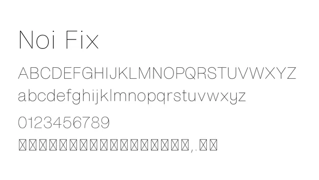
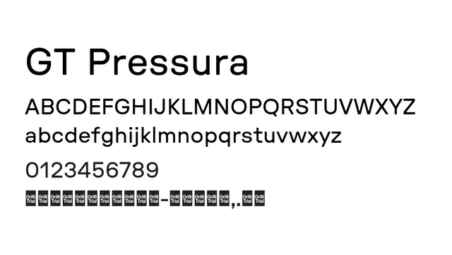
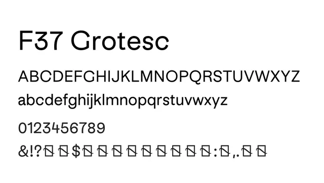
A thin neo-grotesque sans-serif with balanced proportions and minimal character, suited for contemporary branding and editorial work.
Typesans-serif, neo-grotesque
Moodneutral, professional, sophisticated
Summary
A thin neo-grotesque sans-serif with balanced proportions and minimal character, suited for contemporary branding and editorial work.
What to use it for
Ideal for magazine and book typography, brand guidelines, and modern UI design. The consistent, elegant proportions work well for both headlines and body text at appropriate sizes.
Pairing
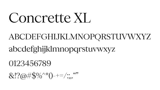
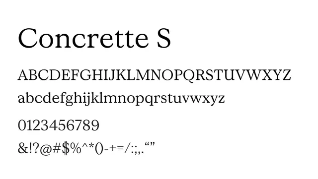
Pairs effectively with Concrette M for a cohesive sans-serif family, or with a serif like Concrette Italic for mixed editorial layouts.