Preview image. Unlock full-res
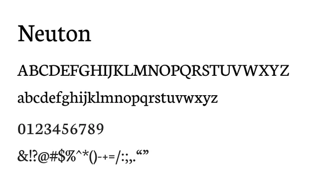
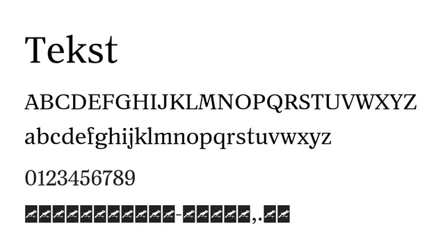
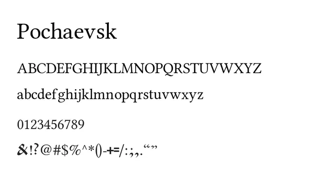
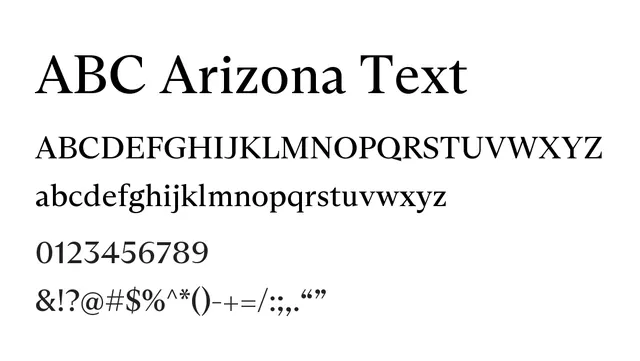
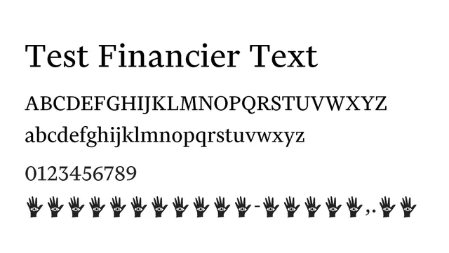
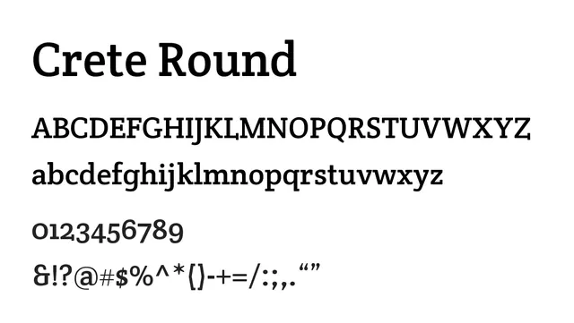
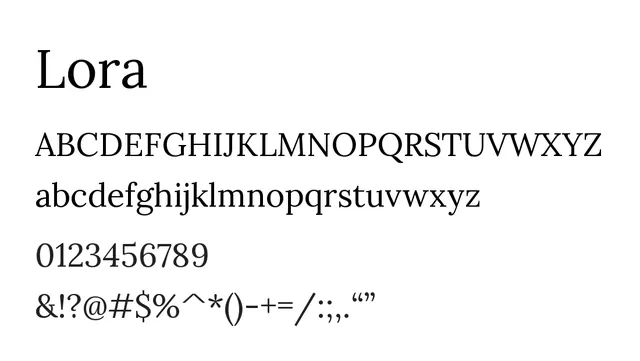
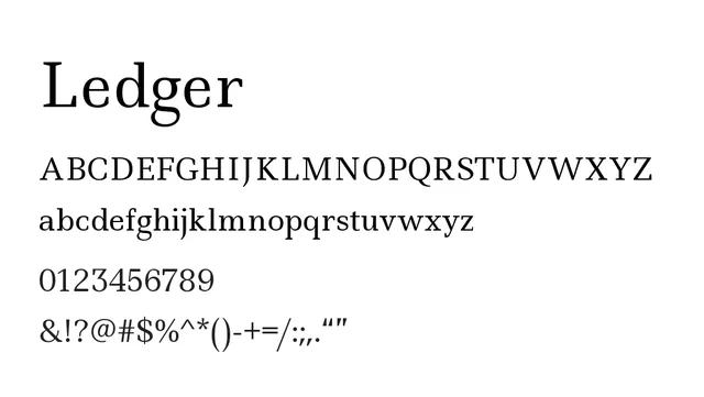
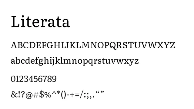
A carefully optimized text serif balancing elegance with exceptional readability for long-form reading.
Styleelegant, readable, traditional, refined
Typeserif, oldstyle, transitional
Moodliterary, warm, classic, trustworthy
Industryeditorial, publishing, literary-magazines, academia, heritage-brands
Summary
A carefully optimized text serif balancing elegance with exceptional readability for long-form reading.
What to use it for
Purpose-built for body text in editorials, books, and literary publications. The moderate contrast and generous proportions ensure comfortable reading over extended passages.
Pairing
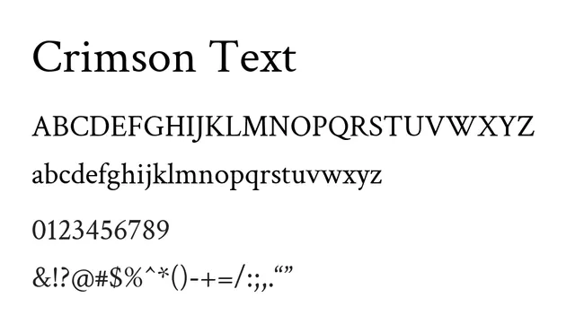
Works beautifully with Crimson Pro for a serif family system, or with Raleway for a serif-sans pairing in editorial contexts.