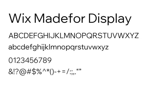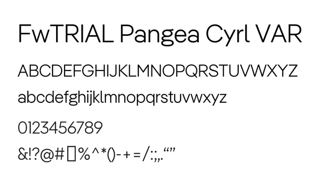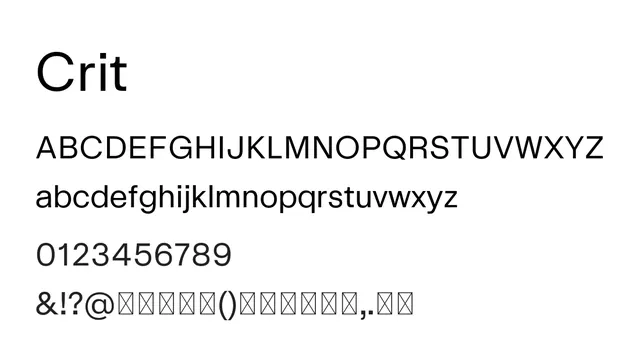
Preview image. Unlock full-res
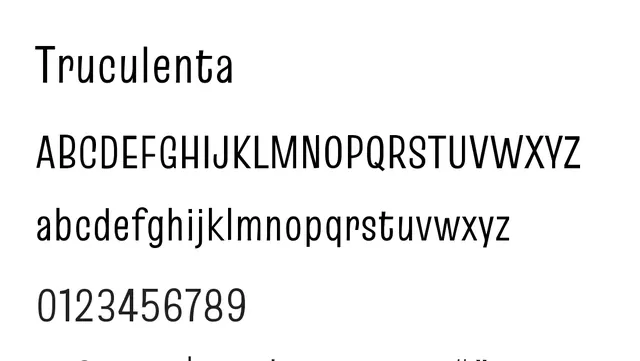
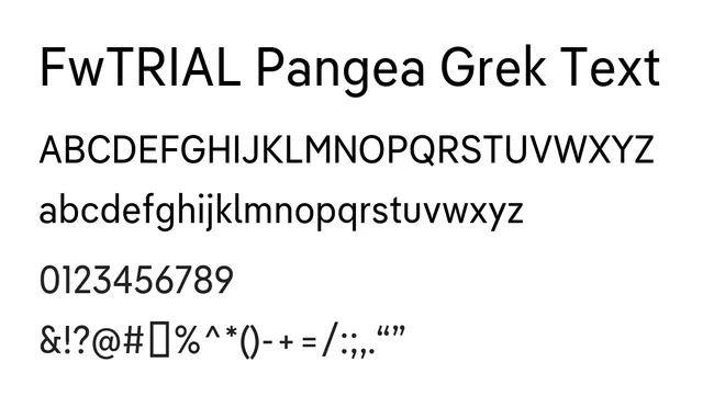
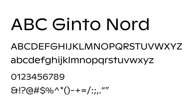
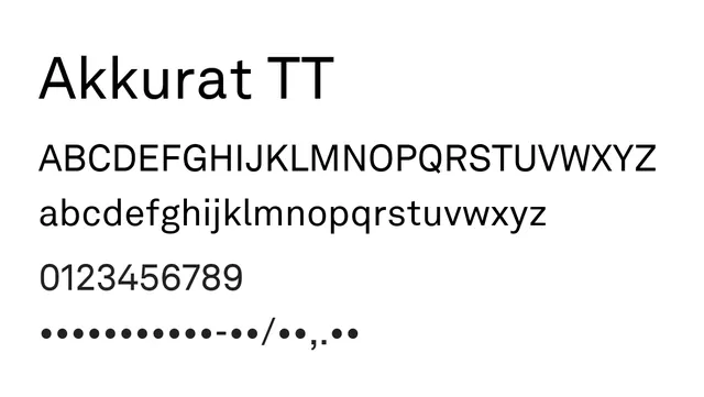
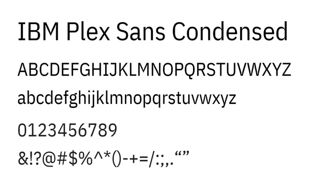
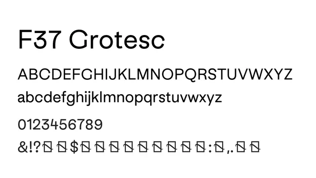
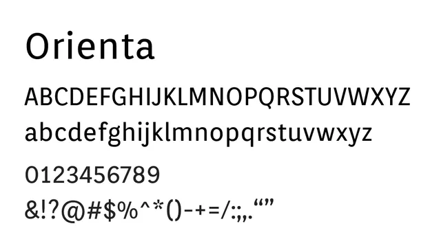
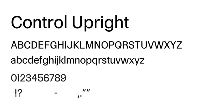
A geometric neo-grotesque sans-serif with precise construction and robust ink traps, optimized for clarity across scales.
Stylemodern, clean, geometric, structured
Typesans-serif, neo-grotesque
Moodtechnical, professional, confident, precise
Summary
A geometric neo-grotesque sans-serif with precise construction and robust ink traps, optimized for clarity across scales.
What to use it for
Excellent for both digital and print applications. The structured geometry and careful detailing support comfortable body text reading while maintaining visual interest in headlines.
Pairing
Pairs effectively with serif fonts like Playfair for editorial contrast, or stays cohesive in all-sans systems with fonts like Coxx.