Preview image. Unlock full-res
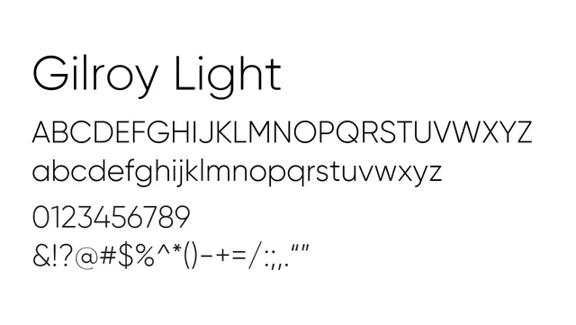
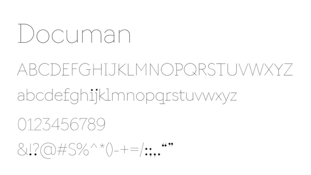
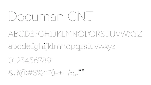
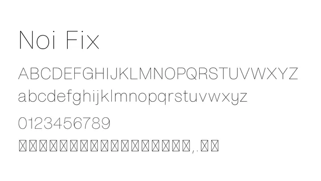
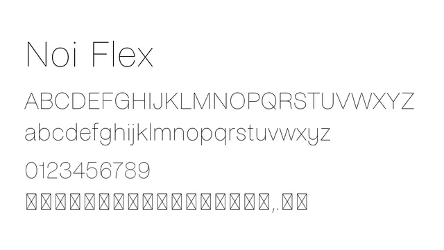
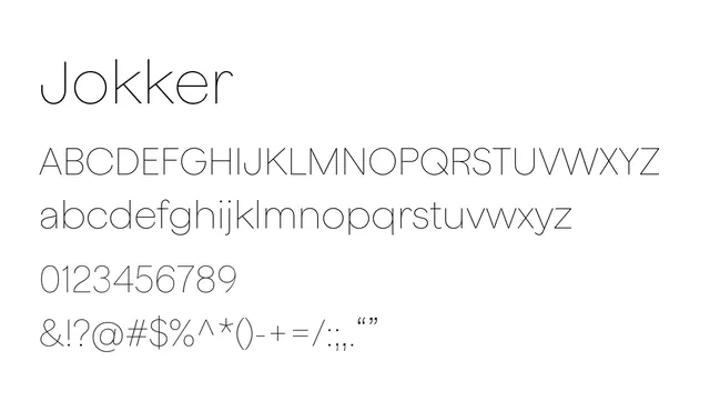
A refined neo-grotesque sans with elegant proportions and low contrast, offering sophisticated readability for body text and modern UI work.
Typesans-serif, neo-grotesque
Moodneutral, professional, calm, sophisticated
Summary
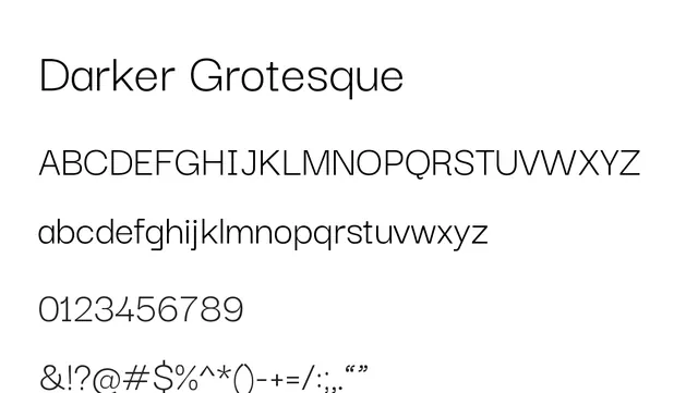
A refined neo-grotesque sans with elegant proportions and low contrast, offering sophisticated readability for body text and modern UI work.
What to use it for
Darker Grotesque excels as a body font in editorial and digital design. Its open apertures and elegant letterforms maintain clarity at small sizes while conveying sophistication. Works equally well for headlines.
Pairing
Pair with a serif like Playfair Display for editorial work, or stand alone for minimalist tech-forward designs.