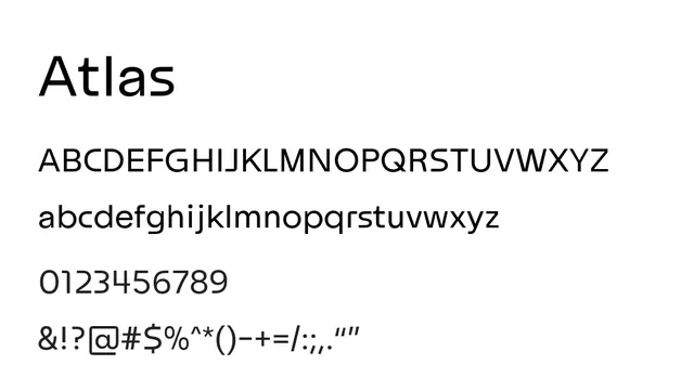
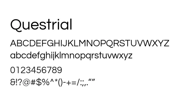
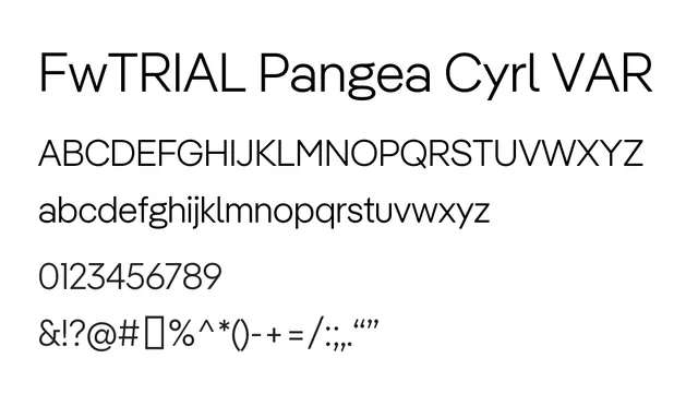
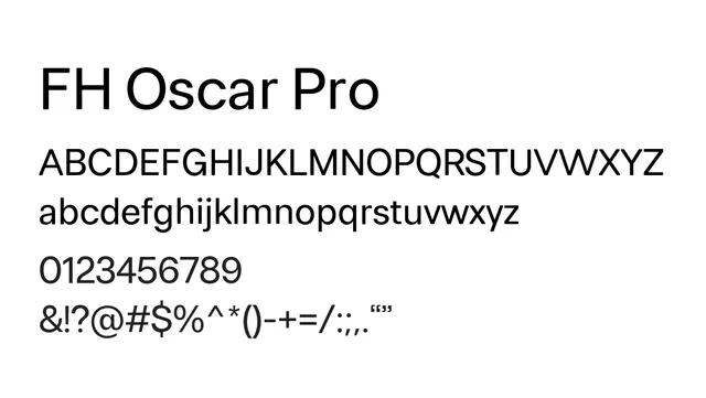
Preview image. Unlock full-res

What to use it for
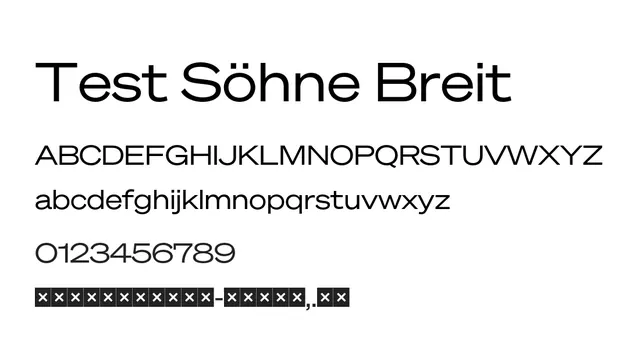
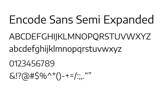
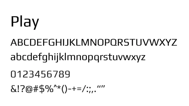
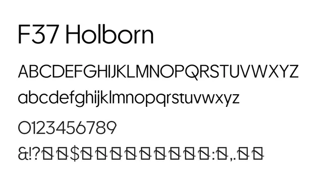
Ideal for body text in web and app design where generous letter-spacing aids readability. The expanded width creates an approachable, welcoming feel suitable for user-facing interfaces.
Pairing
Works independently across weights. Pair with Encode Sans Condensed for dynamic visual hierarchy or with a serif for editorial contrast.
StyleModern, Clean, Spacious, Approachable
TypeSans Serif, Neo Grotesque
MoodNeutral, Professional, Confident, Open