Preview image. Unlock full-res
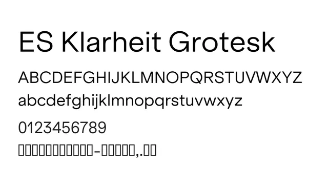
A geometric neo-grotesque sans-serif with exceptional clarity and minimal personality, ideal for contemporary UI and body text where neutrality is required.
Stylemodern, clean, geometric, minimalist
Typesans-serif, geometric
Summary
A geometric neo-grotesque sans-serif with exceptional clarity and minimal personality, ideal for contemporary UI and body text where neutrality is required.
What to use it for
Use Klarheit Grotesk for UI interfaces, body text in tech products, and clean editorial layouts. Its low contrast and tight metrics make it excellent for screen readiness and dense information hierarchies.
Pairing
Pair with Courier Prime or IBM Plex Mono for technical content, or use a serif like Spectral for contrast in editorial contexts.