Preview image. Unlock full-res
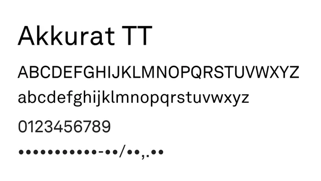
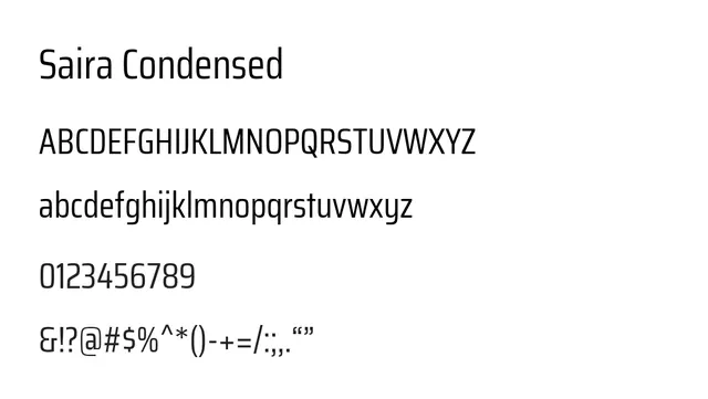
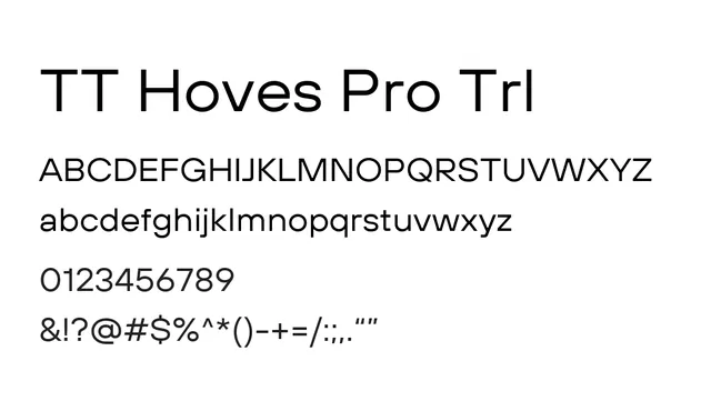
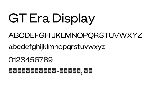
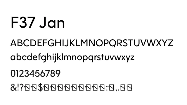
A balanced geometric sans-serif with moderate character width and generous spacing, suitable for both display and body text applications.
Typesans-serif, geometric
Moodneutral, professional, calm
Summary
A balanced geometric sans-serif with moderate character width and generous spacing, suitable for both display and body text applications.
What to use it for
Jan works effectively as both a display and body typeface with its well-balanced proportions. The generous letter spacing makes it readable at smaller sizes and elegant at larger scales.
Pairing
Complements itself well at different sizes, or pair with a serif like Garamond for editorial layouts requiring classical contrast.