Preview image. Unlock full-res
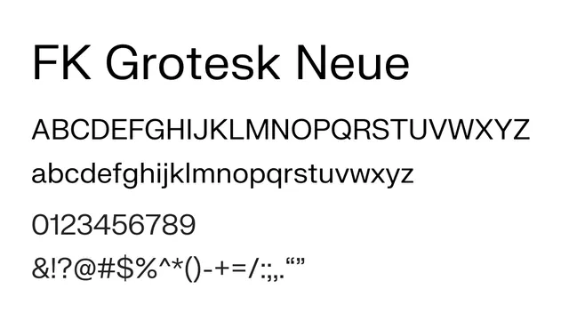
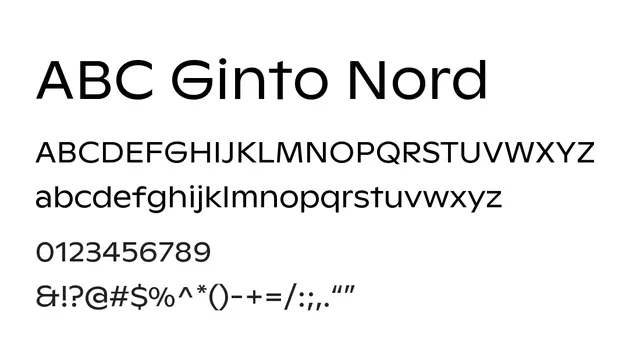
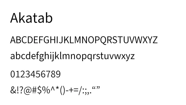
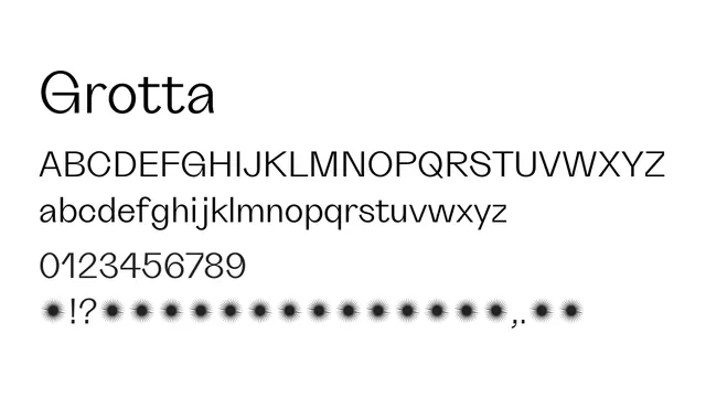
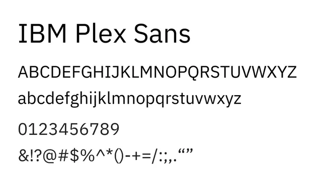
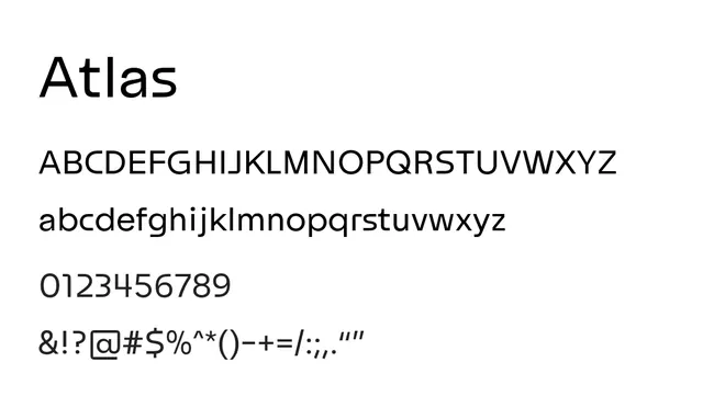
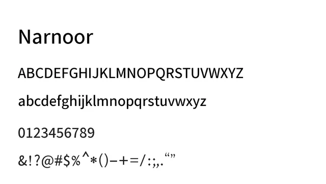
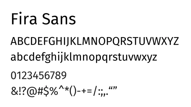
A versatile neo-grotesque sans with perfect balance between geometric clarity and humanist warmth, equally at home in UI and editorial.
Typesans-serif, neo-grotesque
Summary
A versatile neo-grotesque sans with perfect balance between geometric clarity and humanist warmth, equally at home in UI and editorial.
What to use it for
Excellent universal choice for body text in apps and websites. Its slightly open apertures and medium x-height ensure good readability across sizes and contexts. Works well at small sizes without losing character.
Pairing
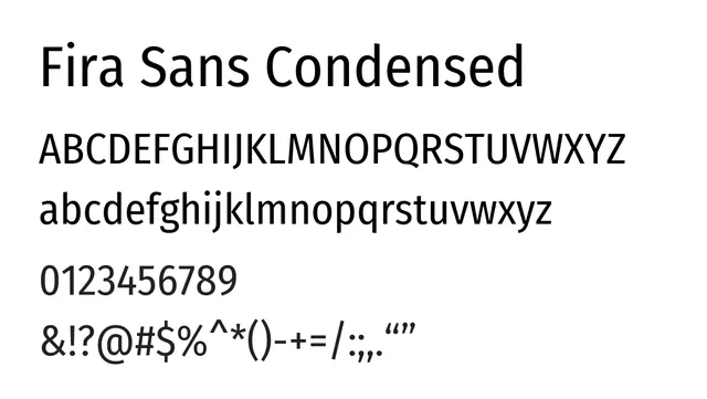
Pairs naturally with Fira Sans Condensed for headlines, or with serif fonts like PT Serif or EB Garamond for editorial layouts.