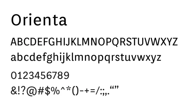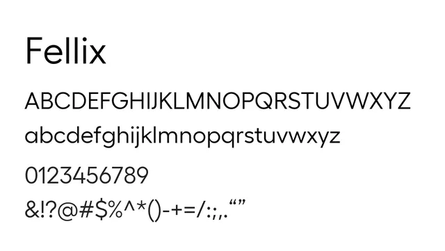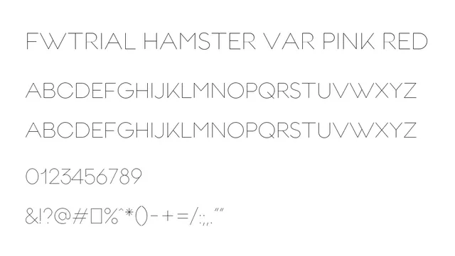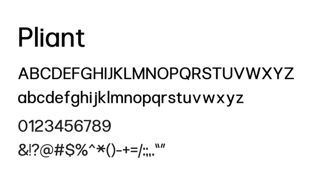
Preview image. Unlock full-res
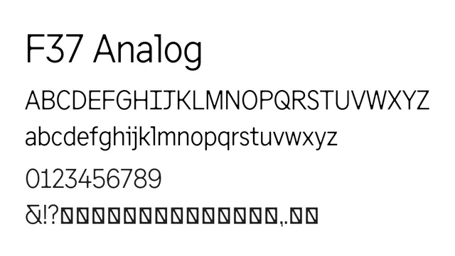
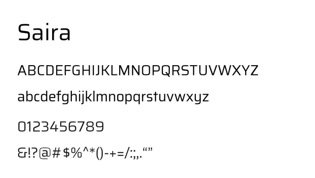
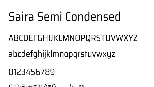
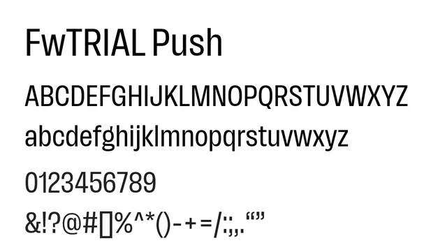
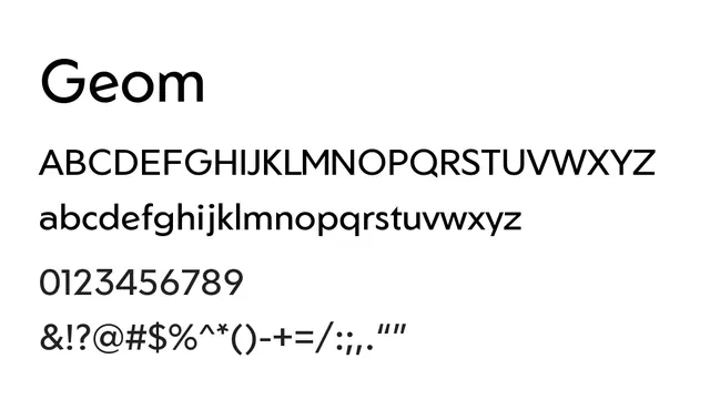
A refined geometric sans with clean, balanced letterforms and strong contrast, optimized for both UI and headline applications in contemporary design.
Stylemodern, geometric, clean, minimalist
Typesans-serif, geometric
Moodneutral, contemporary, precise, refined
Industrytech, design, corporate, minimal-branding
Summary
A refined geometric sans with clean, balanced letterforms and strong contrast, optimized for both UI and headline applications in contemporary design.
What to use it for
Geom is ideal for user interfaces, headlines, and branding applications where geometric clarity and modern aesthetic are priorities. Its balanced proportions work well from medium sizes up, though not optimized for body text.
Pairing
Pair with Gentium Plus for editorial warmth, or with Genos for a cohesive tech-forward system combining clean geometric UI elements with contemporary sans headlines.