Preview image. Unlock full-res
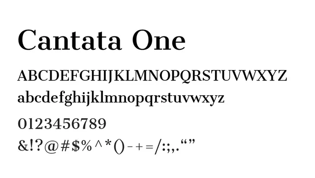
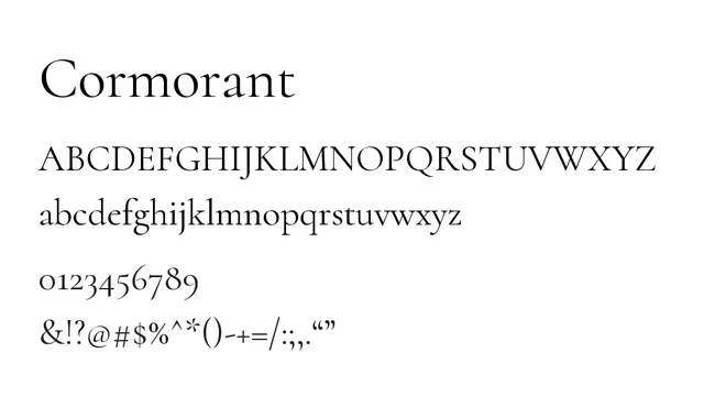
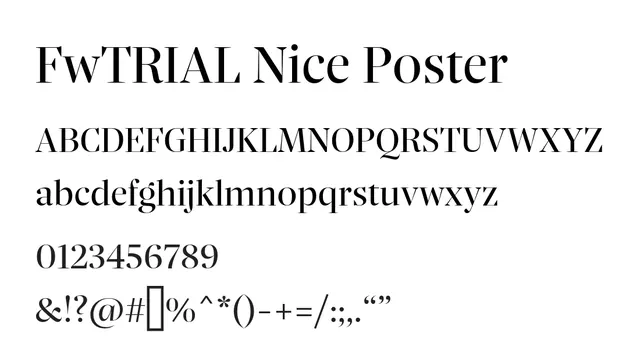
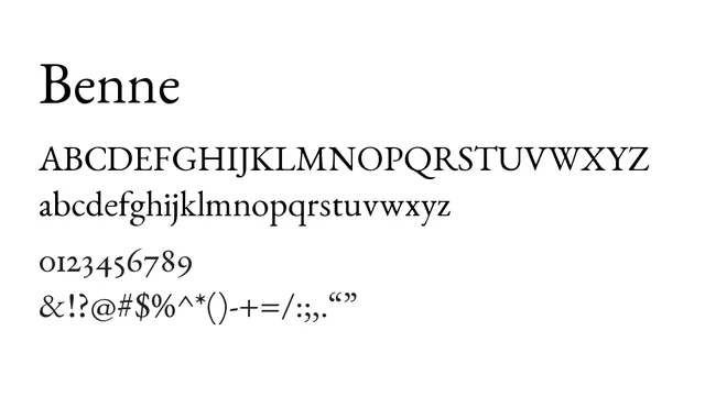
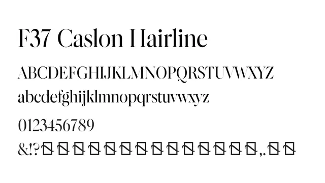
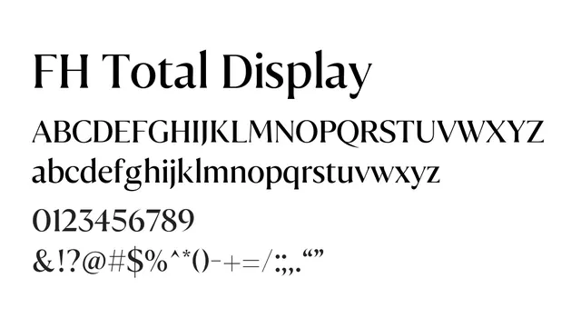
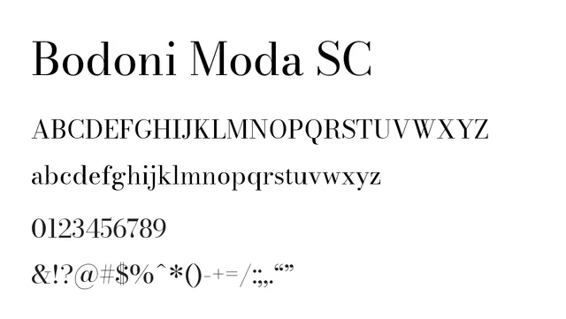
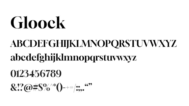
A striking didone serif with extreme contrast between thick and thin strokes and sharp horizontal serifs, conveying luxury and formality.
Styleelegant, high-contrast, formal, refined
Moodluxury, sophisticated, bold, classical
Summary
A striking didone serif with extreme contrast between thick and thin strokes and sharp horizontal serifs, conveying luxury and formality.
What to use it for
Ideal for luxury and fashion branding, editorial headlines, and high-end print design. The dramatic serifs and contrast make it a powerful display face for fashion magazines and upscale brand identities.
Pairing
Pairs effectively with a refined sans-serif like Montserrat or Raleway for elegant editorial layouts, or remains striking when used solo for fashion brands.