Preview image. Unlock full-res
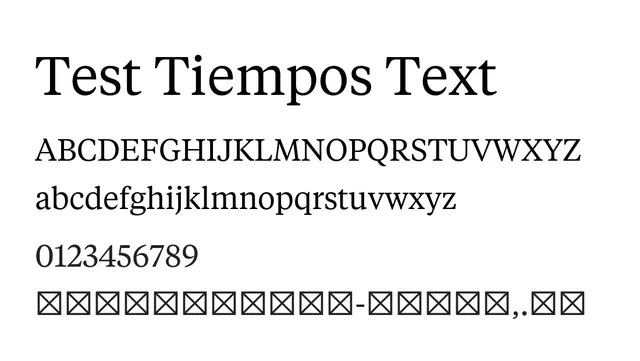
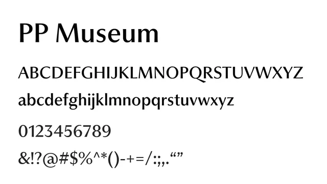
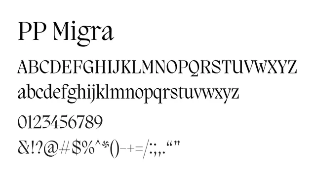
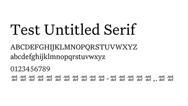
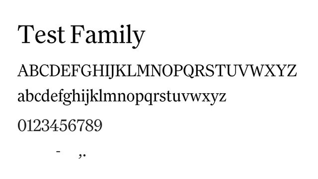
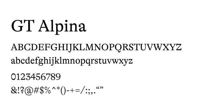
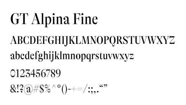
A refined transitional serif with balanced contrast and elegant proportions, bringing classical sophistication to contemporary editorial and luxury contexts.
Typeserif, transitional
Moodsophisticated, authoritative, warm, cultured
Industryeditorial, publishing, luxury, law, culture
Summary
A refined transitional serif with balanced contrast and elegant proportions, bringing classical sophistication to contemporary editorial and luxury contexts.
What to use it for
GT Alpina Fine excels as both body text in print and digital publications and as distinguished headlines. Works beautifully in literary magazines, luxury brand identity, legal documentation, and heritage cultural institutions where refined typography signals expertise and tradition.
Pairing
Combines well with GT Alpina Mono for editorial-technical hybrids, or with Grotesk for striking contrast-heavy layouts.