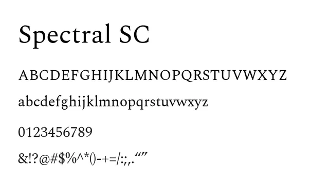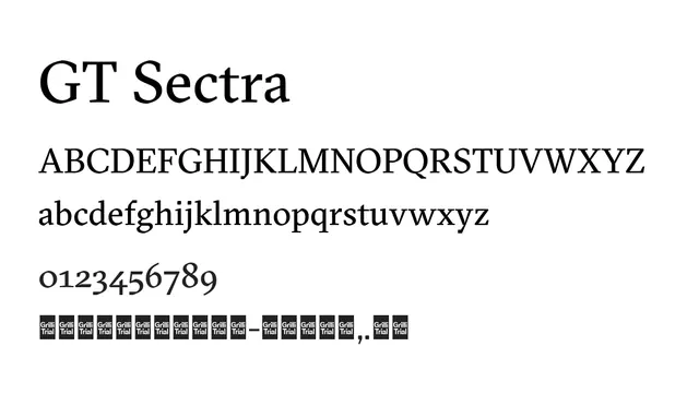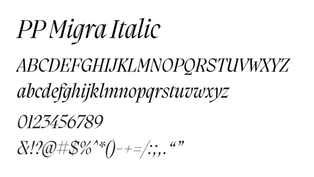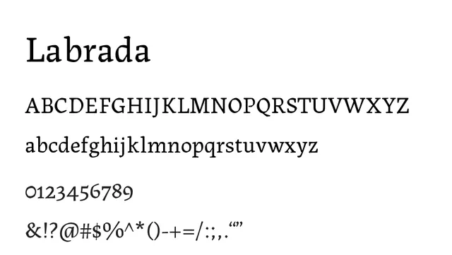
Preview image. Unlock full-res
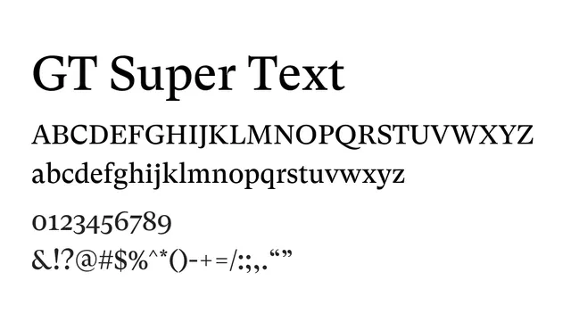
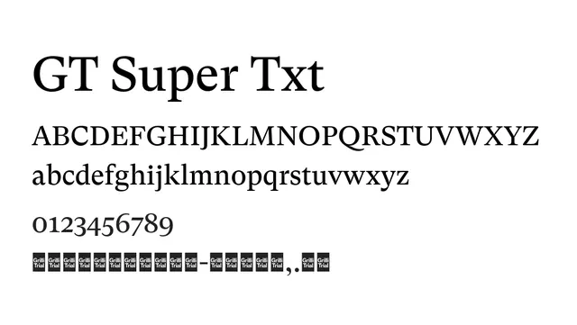
A text-oriented didone serif with refined character and balanced contrast optimized for extended reading in editorial contexts.
Typeserif, didone, medium-contrast
Industryeditorial, publishing, luxury, cultural, academic
Summary
A text-oriented didone serif with refined character and balanced contrast optimized for extended reading in editorial contexts.
What to use it for
Designed for body copy, articles, and text-heavy editorial layouts where legibility and elegance work together. The balanced contrast and thoughtful spacing support comfortable reading at text sizes.
Pairing
Works seamlessly with GT Sectra for headlines or GT Super Display for featured text, maintaining typographic coherence.