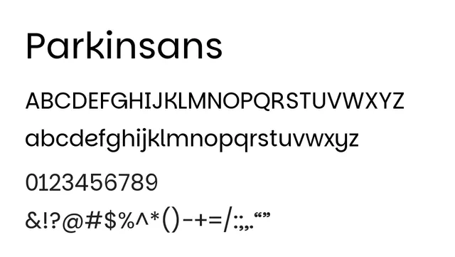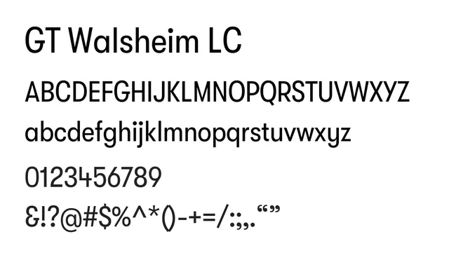
Preview image. Unlock full-res
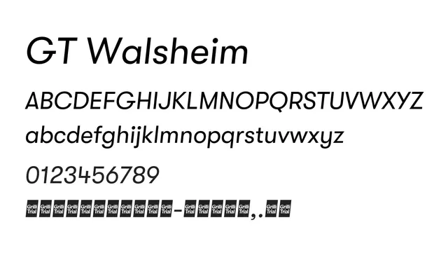
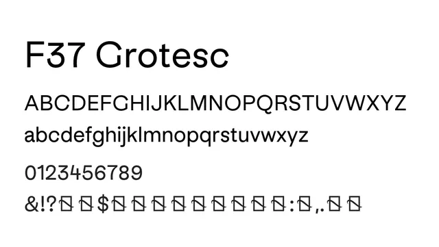
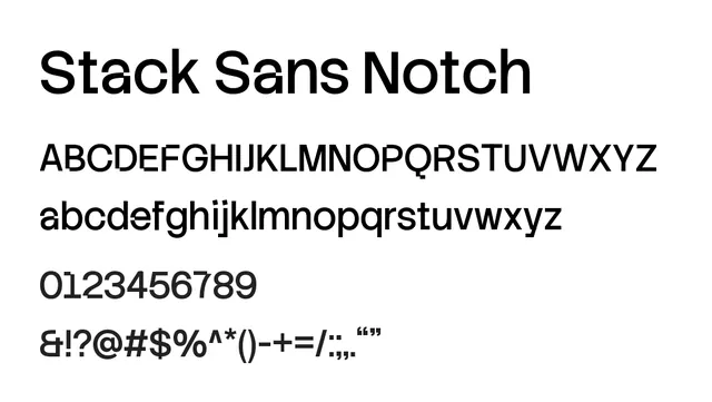
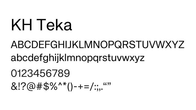
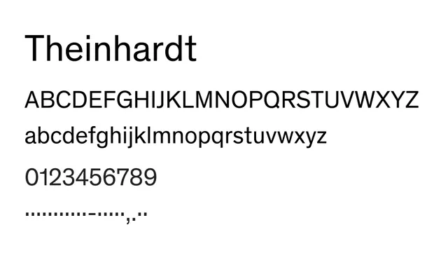
A clean neo-grotesque sans-serif with geometric sensibilities and low contrast, well-suited for interface and corporate applications.
Styleclean, modern, geometric, swiss, professional
Typesans-serif, neo-grotesque, neutral
Summary
A clean neo-grotesque sans-serif with geometric sensibilities and low contrast, well-suited for interface and corporate applications.
What to use it for
Perfect for UI systems, product interfaces, and corporate communications. The clear letterforms and moderate x-height work well for both small interface text and body copy. Handles multilingual content confidently.
Pairing
Works harmoniously with GT Ultra serif family for a complete editorial system balancing structure with refinement.