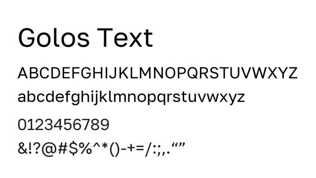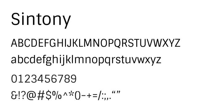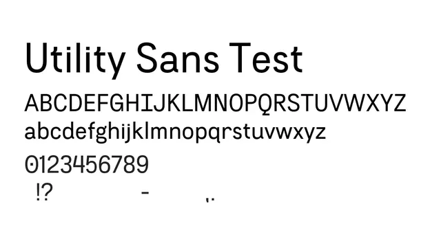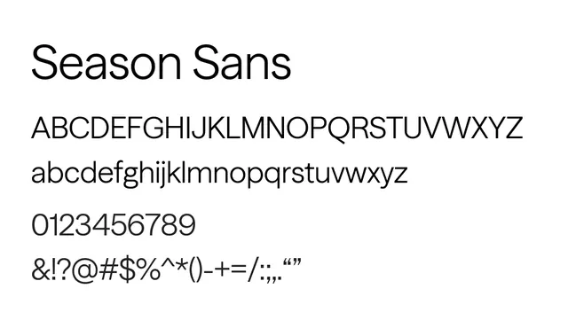
Preview image. Unlock full-res
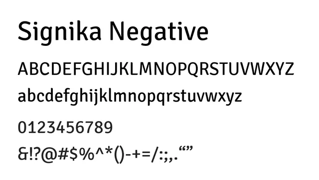
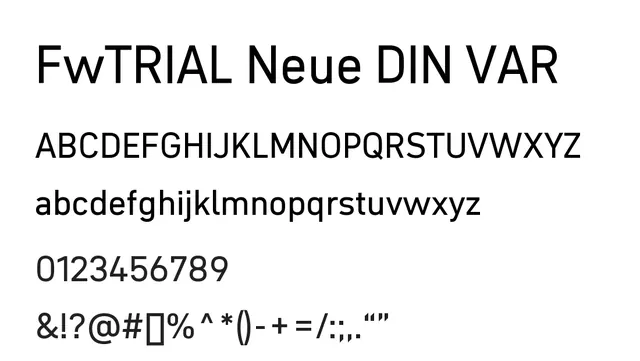
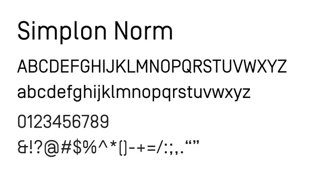
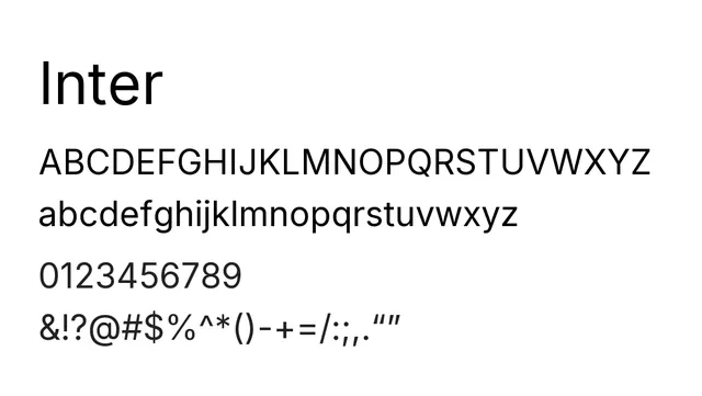
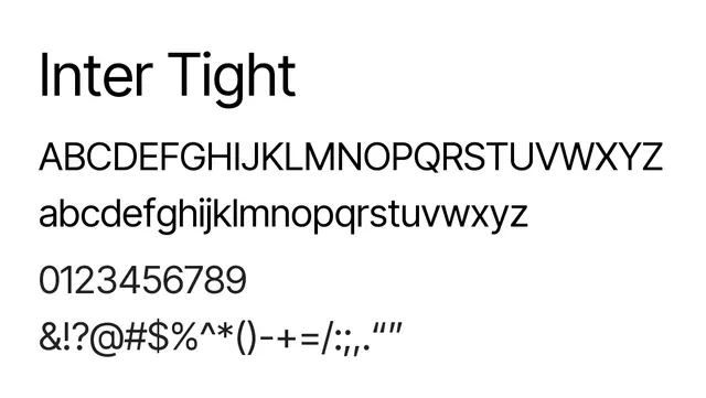
A condensed neo-grotesque sans with generous x-height and tight spacing optimized for UI and compact display at all scales.
Typesans-serif, neo-grotesque
Moodneutral, efficient, professional
Industrysaas, fintech, technology, digital
Summary
A condensed neo-grotesque sans with generous x-height and tight spacing optimized for UI and compact display at all scales.
What to use it for
Designed for tight spacing and screen legibility, Inter Tight excels in UI components, data-dense interfaces, and compact layouts. Excellent for body text in digital products where maximum information density is needed without sacrificing clarity.
Pairing
Pairs naturally with Inter (its sibling) or complements serif body copy in hybrid designs with Garamond or Times New Roman.