Preview image. Unlock full-res
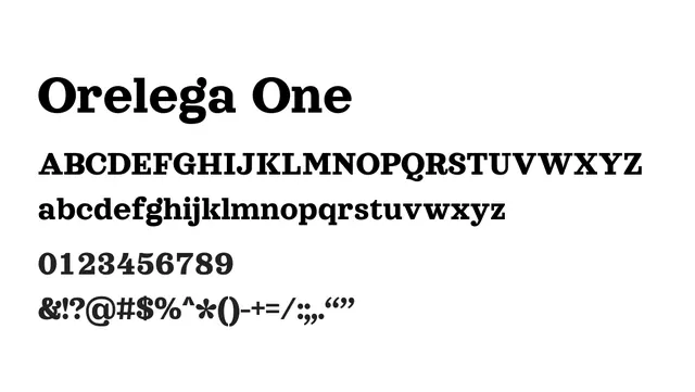
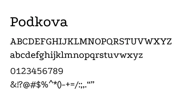
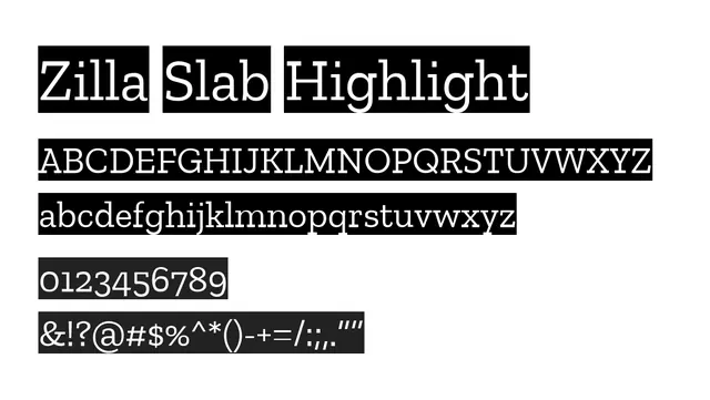
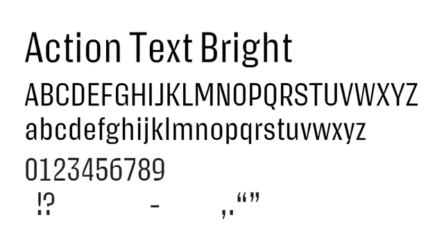
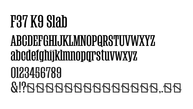
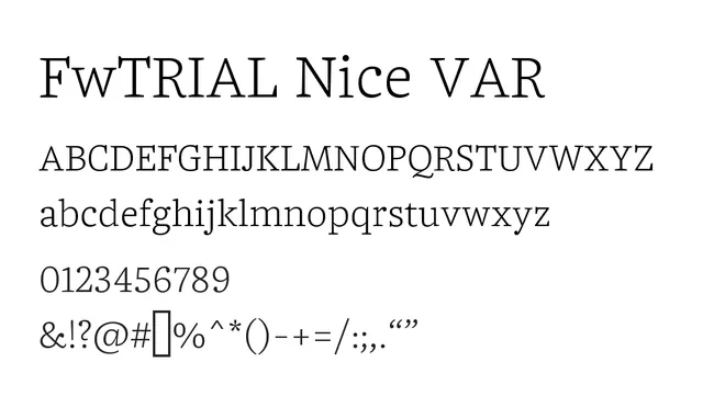
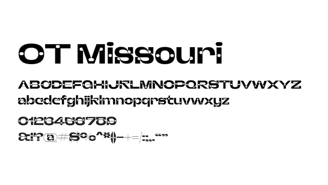
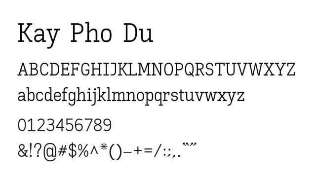
A bold, contemporary slab serif with strong geometric character and distinctive letterforms, balancing modernity with traditional serif warmth.
Typeslab-serif, serif
Moodconfident, creative, contemporary, playful
Industrybranding, publishing, entertainment, lifestyle, editorial
Summary
A bold, contemporary slab serif with strong geometric character and distinctive letterforms, balancing modernity with traditional serif warmth.
What to use it for
Ideal for editorial headlines, creative branding, magazine covers, and design-forward applications. The bold slab structure commands attention while the serif elements add sophistication.
Pairing
Pair with a clean sans-serif like Nunito or Poppins for body text to create a dynamic contemporary editorial system.