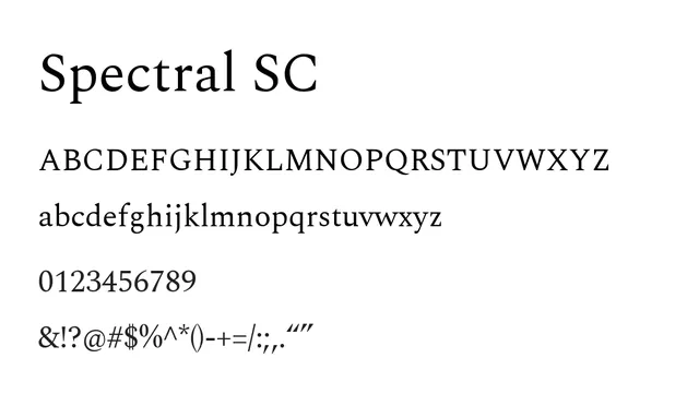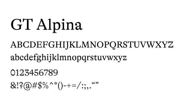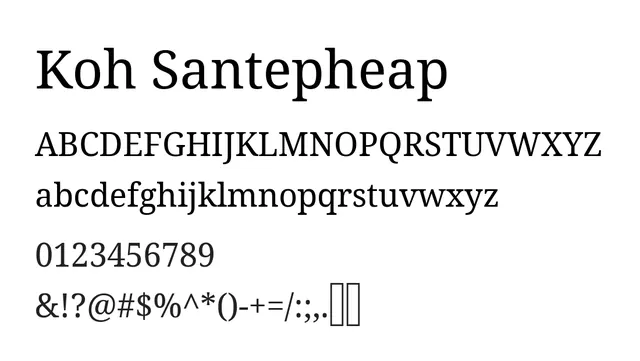
Preview image. Unlock full-res
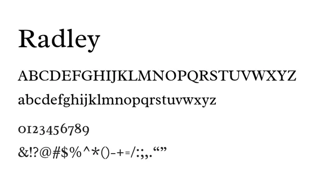
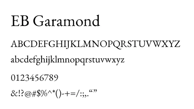
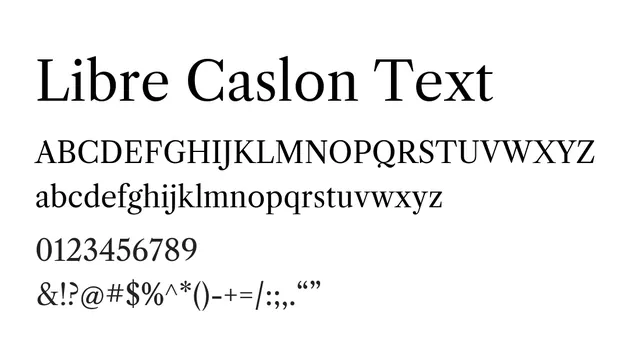
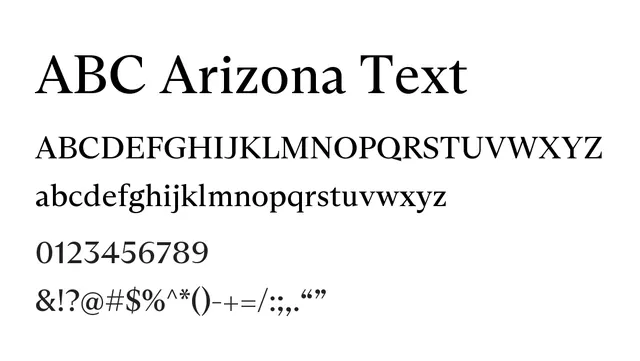
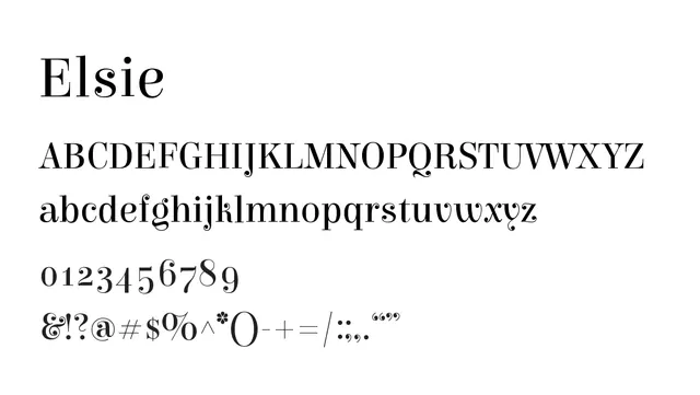
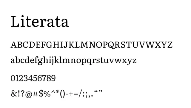
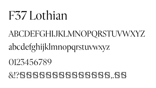
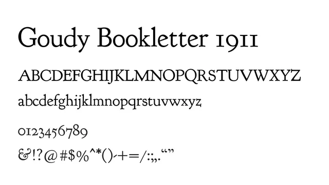
A transitional serif with moderate contrast and elegant proportions ideal for literary and editorial contexts.
Styleclassic, elegant, traditional
Typeserif, transitional
Moodwarm, formal, sophisticated
Industryeditorial, publishing, luxury, fintech
Summary
A transitional serif with moderate contrast and elegant proportions ideal for literary and editorial contexts.
What to use it for
Use as body text in books, magazines, and editorial content. Works well for formal print applications and long-form reading where traditional elegance matters.
Pairing
Pairs well with a humanist sans like Inter or Raleway for headlines and UI elements.