Preview image. Unlock full-res
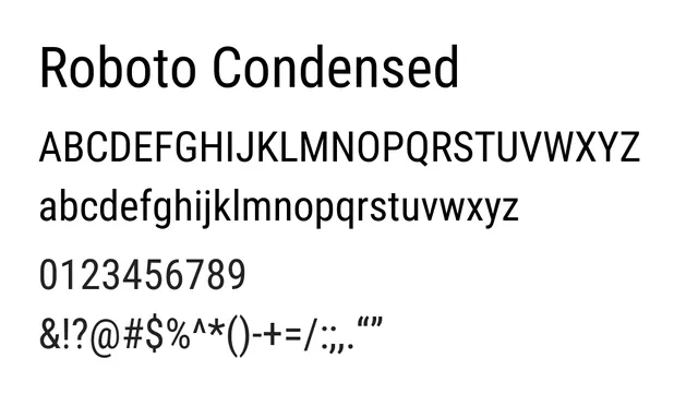
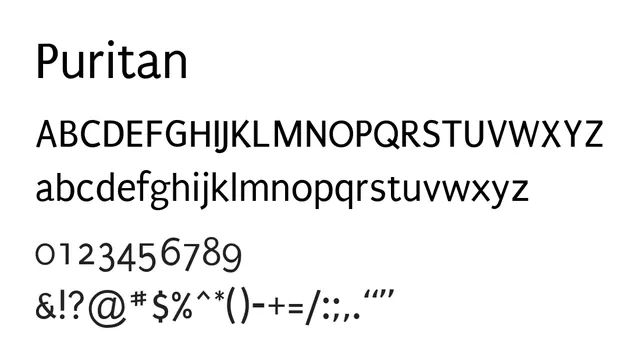
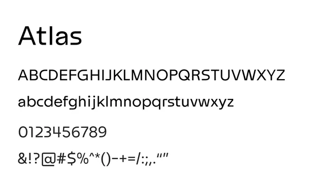
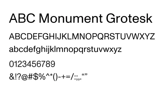
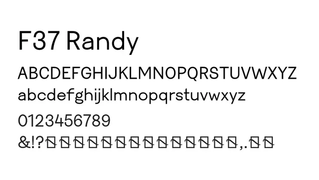
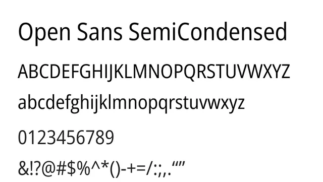
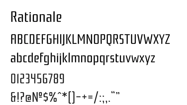
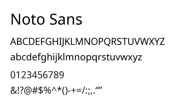
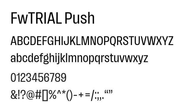
A geometric grotesque sans with exceptionally tall x-height and wide apertures, optimized for legibility in UI and digital interfaces.
Typesans-serif, grotesque
Summary
A geometric grotesque sans with exceptionally tall x-height and wide apertures, optimized for legibility in UI and digital interfaces.
What to use it for
Best suited for digital body text and UI labels where clarity and accessibility are paramount. Works particularly well in data-dense interfaces, dashboards, and applications requiring screen legibility.
Pairing
Pairs well with IBM Plex Serif for editorial contexts or Inter for complementary sans hierarchy.