Preview image. Unlock full-res
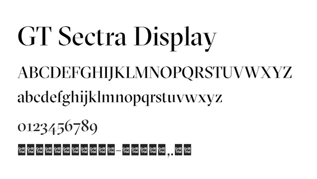
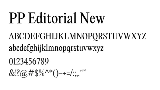
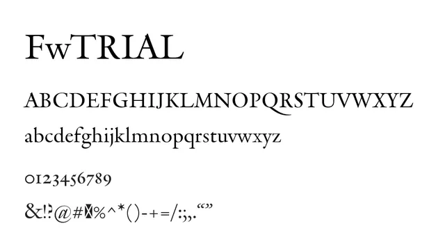
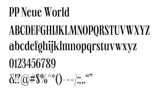
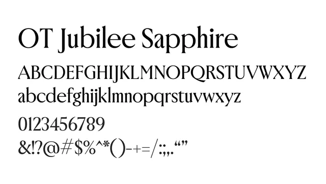
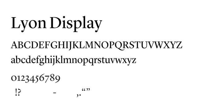
A sophisticated didone serif with pronounced contrast between thick and thin strokes, perfect for editorial headlines and luxury branding.
Styleelegant, traditional, sophisticated, editorial
Industryeditorial, luxury, publishing, fashion, culture
Summary
A sophisticated didone serif with pronounced contrast between thick and thin strokes, perfect for editorial headlines and luxury branding.
What to use it for
Lyon Display excels in headline and display sizes where its elegant letterforms and dramatic contrast create visual impact. Best reserved for 18pt and above to preserve readability.
Pairing
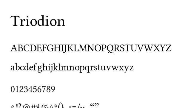
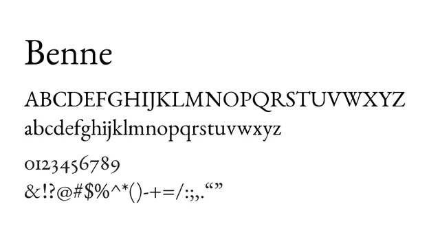
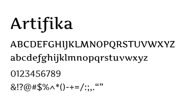
Combines beautifully with Liter for body text or Linear Sans for UI elements in editorial applications.