Preview image. Unlock full-res
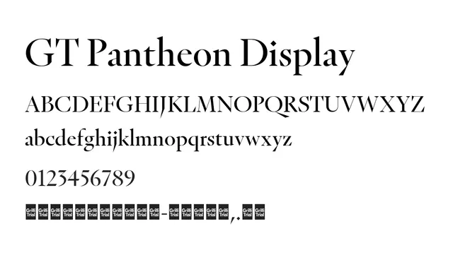
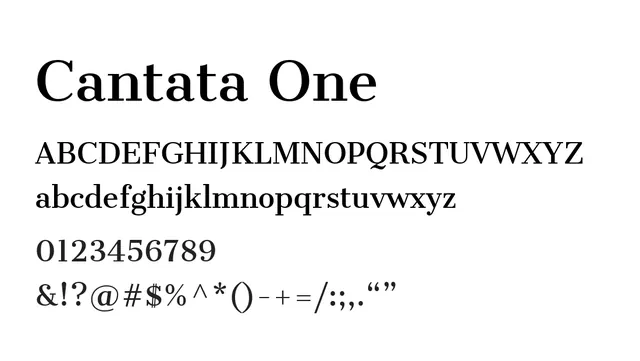
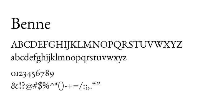
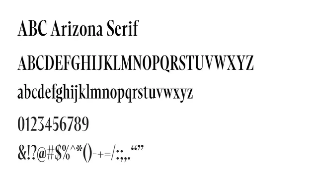
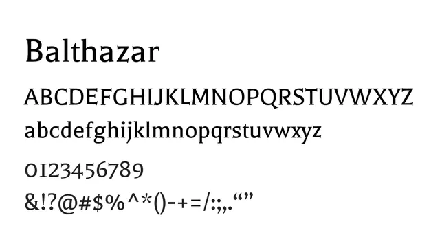
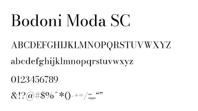
High-contrast didone serif optimized for small caps, bringing classical formality and elegance to headlines and display typography.
Moodelegant, confident, sophisticated
Summary
High-contrast didone serif optimized for small caps, bringing classical formality and elegance to headlines and display typography.
What to use it for
Specifically designed for small caps display, making it ideal for formal headlines, elegant branding applications, and sophisticated editorial display work. Best reserved for display purposes rather than body text.
Pairing
Complements traditional serifs like Martel or geometric sans-serifs for balanced typographic hierarchy, particularly in luxury and editorial contexts.