Preview image. Unlock full-res
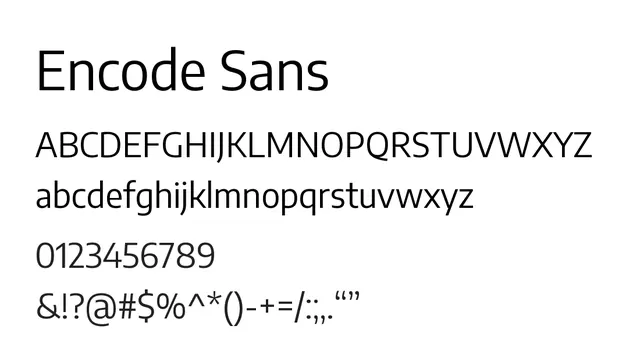
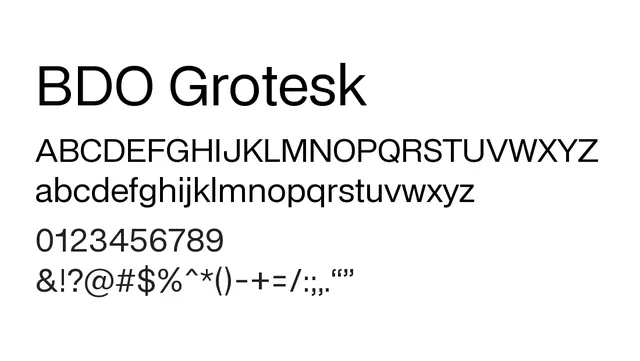
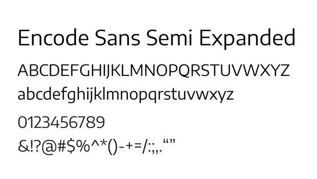
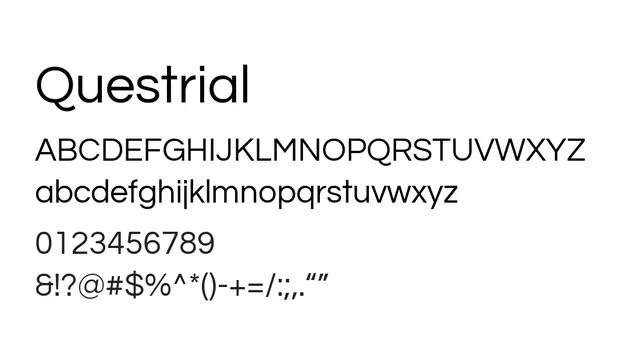
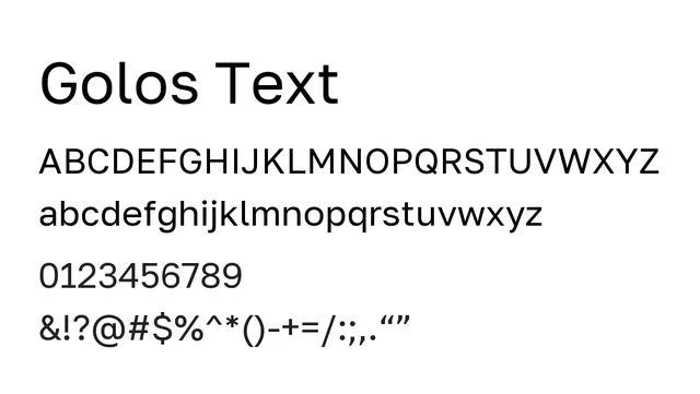
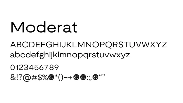
A sophisticated neo-grotesque sans with generous spacing and tall x-height, balancing neutrality with humanist warmth.
Stylemodern, clean, neutral, professional
Typesans-serif, neo-grotesque
Moodneutral, balanced, refined, contemporary
Summary
A sophisticated neo-grotesque sans with generous spacing and tall x-height, balancing neutrality with humanist warmth.
What to use it for
Ideal for both UI and editorial applications where a modern, clean aesthetic is required without the roundedness of Moderat Rounded. Works well in long-form reading and interface design.
Pairing
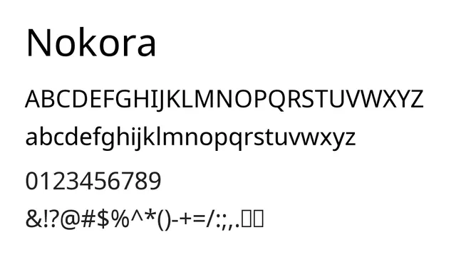
Pairs effectively with Moderat Serif or Noto Serif for editorial combinations.