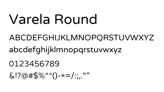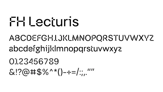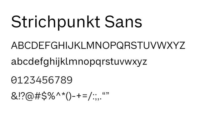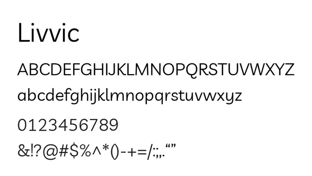
Preview image. Unlock full-res
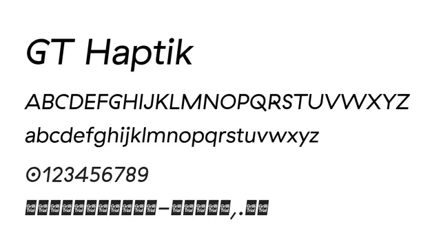
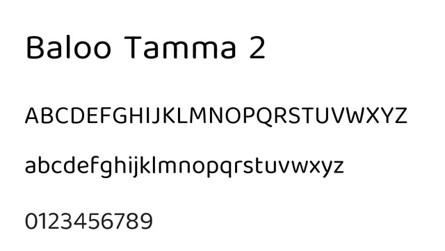
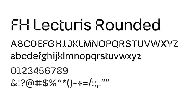
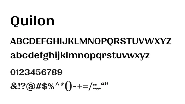
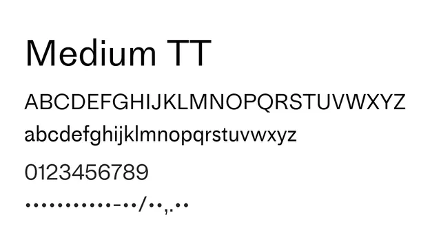
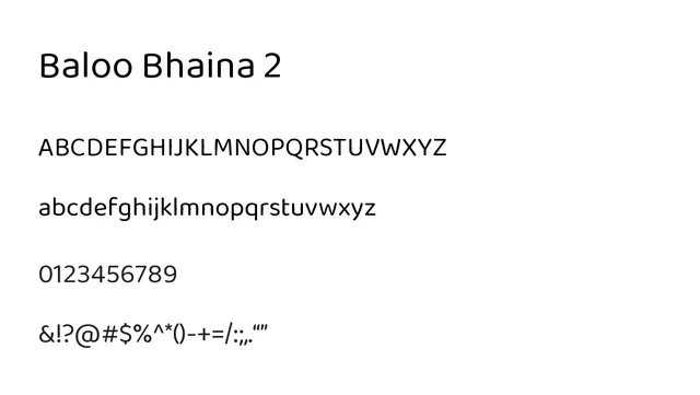
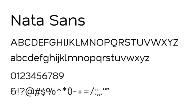
A friendly humanist sans with gentle curves and open letterforms that prioritizes legibility and approachability.
Stylefriendly, modern, accessible, open
Typesans-serif, humanist
Moodapproachable, warm, confident, inclusive
Summary
A friendly humanist sans with gentle curves and open letterforms that prioritizes legibility and approachability.
What to use it for
Excellent for user interfaces, body text in digital applications, and web design. Its open proportions and rounded terminals make it highly readable at all sizes and welcoming in tone.
Pairing
Pairs well with a geometric display sans like Raleway for headlines, or with a warm serif like Crimson Text for editorial applications.