Preview image. Unlock full-res
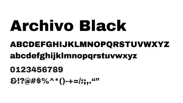
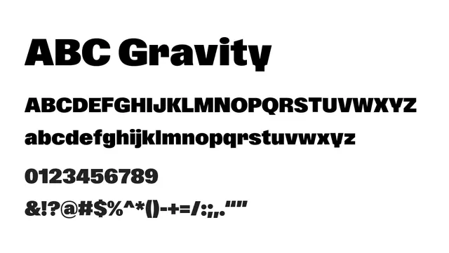
Bold display variant of Noto Sans with commanding presence and dramatic scale suited to headlines and branding applications.
Typedisplay, neo-grotesque
Industryeditorial, branding, fintech, tech, publishing
Summary
Bold display variant of Noto Sans with commanding presence and dramatic scale suited to headlines and branding applications.
What to use it for
Best reserved for headlines, display sizes, and prominent branding elements where bold weight and impact are desired. The heavier stroke weight commands attention and creates visual hierarchy in editorial layouts.
Pairing
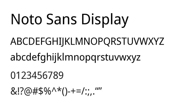
Pair with regular-weight Noto Sans for body text to create strong visual contrast, or combine with Noto Serif for sophisticated editorial hierarchies.